 Description Description
Orders nodes are used to define the possible orders in which data can be displayed in grids defined using Grid node nodes, or implicit grids in WorkWith, SubWorkWith, or Prompt nodes. The available orders are specified by adding CompoundOrder children to this node.
The runtime appearance for a grid's orders varies depending on the Knowledge Base configuration and the types of order available.
By default, simple orders are associated with the grid's columns. When the title of the column is clicked the grid's contents are ordered by the column's attribute. If clicked again, the order is reversed from ascending to descending.
 |
| Appearance of order selection using columns in runtime |
Compound orders cannot be associated with a single column. Because of this, when compound orders exist, a combobox control is included in the grid settings menu as shown in the image below. An option is included in the combobox for each CompoundOrder node contained in the orders node, and also for each Simple Order node (more than one option may be included for each simple order node, depending on the "Direction" property).
The developer can choose to show the combobox even if the grid only includes simple orders using the "Show Order By When Only Simple Orders" property in K2BWebPanelDesignerSettings and K2BTools General Settings.
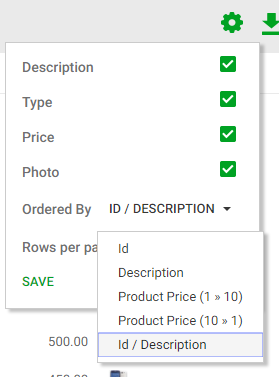 |
| Appearance of order selection combobox in runtime |
When the combobox is shown, orders associated with grid columns continue to function and the combobox is updated whenever they are used.
Note: when using free style grids the combobox is always generated, as the grid has no titles and thus the simple orders are not accessible outside the combobox.
|