 Description Description
Multiple selection nodes can be used inside Web Panel Designer to include Multiple Selection grids inside web panels. These grids can be useful in scenarios where an action must be performed on a set of data atomically, and an action with multirow selection cannot be used. These grids allow the final user to have a grid containing the candidate items on which the action can be performed, and a separate grid showing only the items the user has already selected.
Later, when executing an action, the developer can retrieve the collection of selected items by using an SDT created specifically for this purpose.
For more information on how to use this type of node, it is recommended that you see the user guides Add MultipleSelection from Transaction action and Generate MultiSelection SDT action.
 |
 |
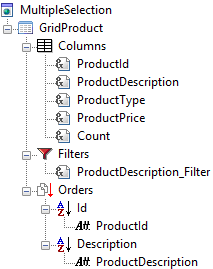
| Multiple selection node |
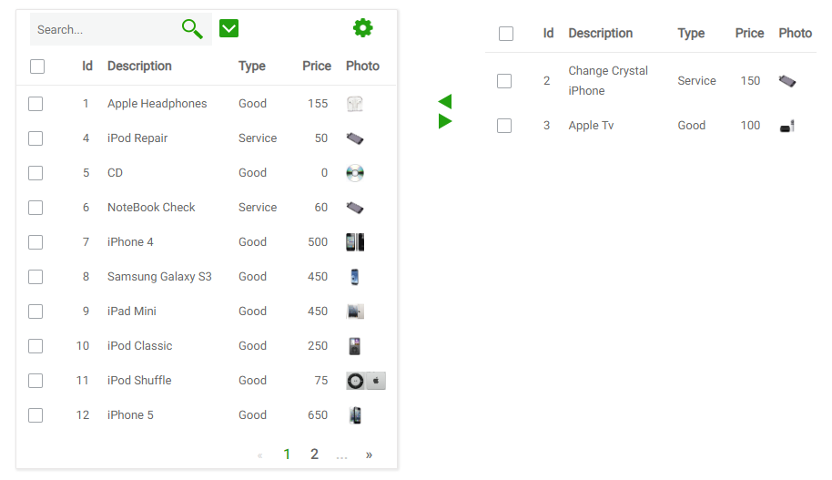
Multiple selection runtime appearance |
As you can see in the image above, both grids are defined in only one grid node inside Web Panel Designer. By default all variables or attributes included in the Grid Columns node are shown in both grids. To change this behaviour there is a property in these nodes named "Show In Selected Grid". If this property is set to false, the variable will only be visible in the candidate items grid.
It is necessary for the multiple selection control to work that at least one variable inside the grid has the property "Selected Key" set to true. If the grid was created Add MultipleSelection from Transaction action this value is set automaticaly in the transaction Primary key.
| Category |
Name |
Value |
| General |
Id |
Identifier for this node. Must be unique inside the web panel. |
| SDT |
SDT that should be used to store the selected items. See Generate MultiSelection SDT action. |
| Add Image |
Image that should be used in the "add items" button. |
| Remove Image |
Image that should be used in the "remove items" button. |
| Allow Drag And Drop |
Determines if drag and drop will be enabled for this multiple selection control. |
| Theme |
Scroll |
Determines if the "selected items" grid should contain scroll controls (and thus have a maximum height and width), or should have no scroll controls, in which case the grid will grow as data is added. |
In the following table, <MultipleSelectionId> should be replaced with the value of the "Id" property.
| Name |
Moment of execution |
Detailed description and possible uses |
| U_LoadSelectedGridRowVars(<MultipleSelectionId>) |
On each selected grid row load |
This subroutine is executed once for each row in the candidate items grid, before loading them. Using this subroutine the developer can perform various actions. The most common use case for this subroutine is the scenario where the developer wishes to calculate a value which depends on the data selected. For example, in a multiple selection grid that contains products and its prices, the developer may wish to calculate the total price of the selected items.
|
As in grid controls, children in MultipleSelection nodes have specific meanings. Below these meanings are explained.
 Grid node or Grid node or  Free style grid nodes. Only one of these nodes can be placed as a child in a multple selection node. Using these, the developer may define the structure of the grid that shows the available items. The selected items grid is always shown using a common (non-freestyle) grid. Free style grid nodes. Only one of these nodes can be placed as a child in a multple selection node. Using these, the developer may define the structure of the grid that shows the available items. The selected items grid is always shown using a common (non-freestyle) grid. Attributes node nodes. This node can be added only once. The idea behind the scenario is to show a summary of the selected items using variables added under this node. For example, in a multiple selection grid that contains products and its prices, the developer may included the total product price here. Attributes node nodes. This node can be added only once. The idea behind the scenario is to show a summary of the selected items using variables added under this node. For example, in a multiple selection grid that contains products and its prices, the developer may included the total product price here.
|