| Category |
Name |
Value |
| General |
Name (Id) |
Contains the variable name |
| Based On |
Defines the Type for the variable. Variables must be defined based on an Attribute or a Domain. |
| Is Collection |
Determines if the variable is a collection or not. See Collection variables in K2BTools. |
| Description |
Description text to be set to the attribute |
| Form |
Description Layout |
Defines the position of the description relative to the control. The default value for this property is loaded from the "Descriptions Layout" property in this node's parent. Note: Only available in SD Panels. |
| Visible |
When set to false, the attribute will be hidden inside the web form. |
| No Skip |
When set to true, the variable will be shown in the same line as the last one. See NoSkip property.
Important: This property existed until K2BTools 13.2. In K2BTools 14.0 it was replaced by the "Element Relative Position" property.
|
| Element Relative Position |
Allows to configure the position of the element relative to the previous element. The possible values are:
- New row
- Same cell
- New cell
For more information read Element Relative Position property
|
| Readonly |
When set to "False" user can change the variable's value, set to false variable will not be editable |
| Enabled |
Contains the value for the Enabled property in the control. Note: Only available in SD Panels. |
| Invite Message |
Contains the string that will be used as an invite message. Only available when using Responsive Web Design. |
| Tooltip |
Tooltip to be used when generating the attribute control. |
| Left Text |
Text placed before the attribute, after the description. |
| Right Text |
Text placed after the attribute. |
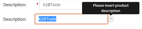
| Contextual Help Value |
A text that will appear alongside the variable to provide help for the user. Character values must be placed between quotes. This property's value must contain an expression. This allows the developer to concatenate attributes values ("Please insert value for " + &ProductDescription)
Example:
|
| Format |
Format of the attribute value.
- Text
- Html
- RawHtml
- TextWithMeaningfulSpaces
The format property allows you to render html code placed inside an attribute.
|
| Behaviour |
Required |
Set to true an "*" symbol will appear at the description indicating variable must hava a value.
|
| Date Picker |
Determines if a date picker should be associated to this variable's control. |
| Return On Click |
Used when the web panel being built is a prompt implementation. Indicates that after the action's code the prompt should return to its caller.
|
| Appearance |
Class |
Attribute's theme class. |
| Description Class |
Description's theme class. |
| Left Text Class |
Avaiable only if left text is not empty. Left Text's theme class. |
| Right Text Class |
Available only if right text is not empty. Right Text's theme class. |
| Autoresize |
Indicates if the attribute's control should be resized automatically or not. |
| Width |
If autoresize is set to false It allows to place attribute width. |
| Height |
If autoresize is set to false It allows to place attribute height. |
| Invisible Mode |
Contains the value for the Invisible Mode property in the control. Note: Only available in SD Panels. |