 Description Description
This node can be used to group actions into a single control, consuming less space in the screen. This could be used for actions which are not used frequently by the user. The actions included in the control are this node's children. Thus, if a an action group node contains three Action children, these will be the options shown to the user.
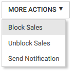
In the following example the action group contains two actions. The user must select the desired option in the after opening the action group.
 |
| Action group |
| Category |
Name |
Value |
| General |
Name |
Contains an identifier for this node. This name should be unique in each panel. |
| Caption |
The string that will be shown prompting the user to select an option. |
| Please select Item Message |
The error message that should be shown if the user clicks the "execute" button without choosing any option in the combobox before.
Note: This property is used only when the "Execute Combo Action On Click" property in Web Panel Designer Settings is set to "False".
|
| Position |
Determines the position in the screen where the action will be located.
|
Action groups are supported in K2BOrion Theme, K2BOrion Design System and Aries Design System. They are not supported in earlier Web Themes like Modern or Flat.
|