 Description Description
Free style grids nodes are included in K2BWebPanelDesigner in order to include Free Style Grids in the generated web panel. For more information on how GeneXus defines and uses Free Style Grids, check the corresponding documentation.
Free style grids nodes behave in a very similar way to grid nodes. If there is a topic which does not appear to be covered in this page, check the Grid node documentation. The main difference between grids and free style grids is the runtime appearance. The loading of the grid's data is equal between these two types of grid.
 |
 |
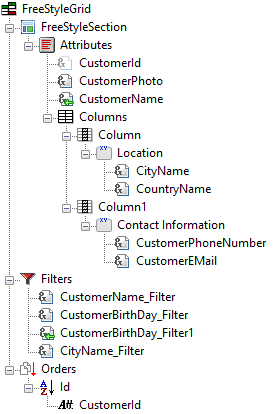
| Free style grid definition |
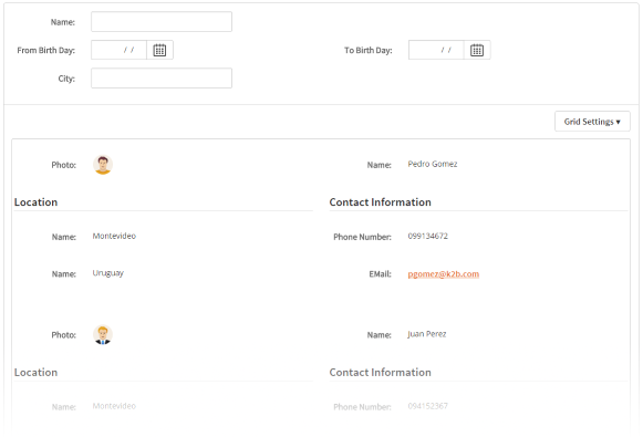
Runtime appearance |
Two images are shown above: The definition of a Free Style Grid in K2BWebPanelDesigner, and the runtime appearance for this instance. Note how many types of controls can be included as contents in the free style grid, such as groups, tabs, and line separators. More options are available (See child nodes).
Free style grids contain all properties contained in grid nodes. Below, only properties specific to Free Style Grids are shown.
| Category |
Name |
Value |
| Appearance |
Columns |
The number of columns the free style grid will have. See the GeneXus documentation about this property. |
| Columns Extra Small |
The number of columns the free style grid will have when viewed in a device with an "Extra Small" screen width. |
| Columns Small |
The number of columns the free style grid will have when viewed in a device with an "Extra Small" screen width. |
| Columns Medium |
The number of columns the free style grid will have when viewed in a device with an "Extra Small" screen width. |
| Columns Large |
The number of columns the free style grid will have when viewed in a device with an "Extra Small" screen width. |
There are no user subroutines associated specifically to this type of node. However, nodes of this type inherit all the grid node user subroutines. User subroutines for that type of node can be found on that page.
Free Sryle Grid nodes have specific children with special meanings. Unlike other types of node, in this case the children of the node define its behavior. Also, in many cases there can only be one node of a certain type inside the grid. Available nodes, and their purposes, are:
 FreeStyleSection. This node is used to define the contents and the layout inside the Free Style Grid. The definition of the Free Style Grid is very flexible, by allowing many types of node as children to this one. FreeStyleSection. This node is used to define the contents and the layout inside the Free Style Grid. The definition of the Free Style Grid is very flexible, by allowing many types of node as children to this one. Filters. This node is used to define which will be the filters specific to this grid. It is important to note that nodes of this type can never appear outside grids, as their purpose is tightly connected to the grid itself. These nodes can appear at most once inside each grid. Filters. This node is used to define which will be the filters specific to this grid. It is important to note that nodes of this type can never appear outside grids, as their purpose is tightly connected to the grid itself. These nodes can appear at most once inside each grid. Orders. This node is used to define which will be the orders generated for this grid. These nodes can appear at most once inside each grid. Orders. This node is used to define which will be the orders generated for this grid. These nodes can appear at most once inside each grid. Summary. This node can be used to present a summary of the data shown in the grid. For example, this could be used to display a total amount calculated from the values of a particular column. Summary. This node can be used to present a summary of the data shown in the grid. For example, this could be used to display a total amount calculated from the values of a particular column. Actions. This node contains Action nodes that should appear alongside the grid. Actions included in this node will not be shown as In-Grid actions (as defined in the Action page). If the developer wishes to include actions inside the grid, they must be included in the FreeStyleSection node. Actions. This node contains Action nodes that should appear alongside the grid. Actions included in this node will not be shown as In-Grid actions (as defined in the Action page). If the developer wishes to include actions inside the grid, they must be included in the FreeStyleSection node.
|