The collection view node can be used to define an UI component where datasets will be shown in the UI, using different views.
The datasets referenced in these nodes may be filtered using a Filters node. The component may include actions, using the Actions node.
This node can be thought of as a generalization of the grid node, as this node allows the developer to create regions to show data with filters and actions but without using a grid.
The data can be used using the Calendar view and Business Analysis View nodes.
The runtime apprearance for this node varies significantly depending on the child nodes and its properties.
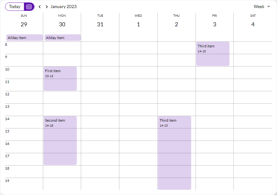
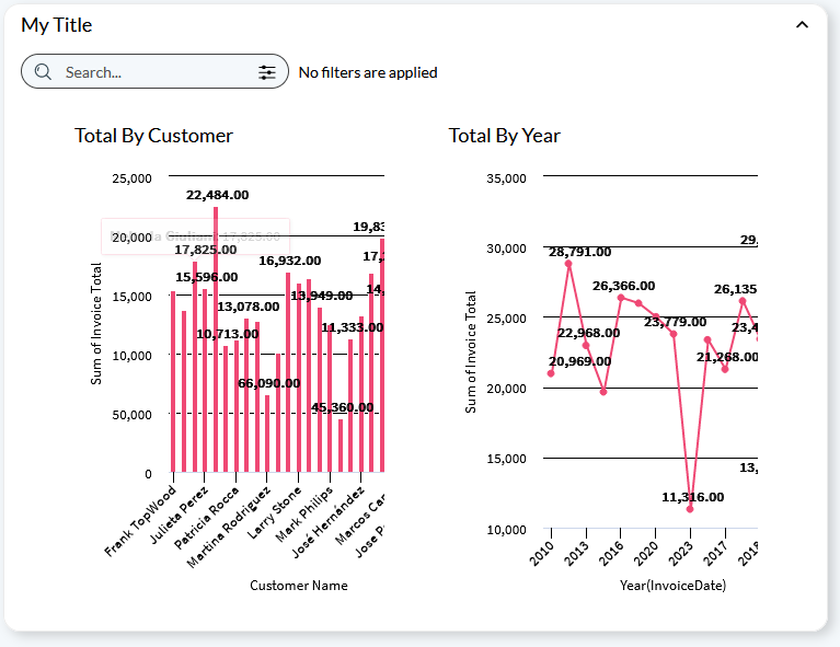
To ilustrate this, three screenshots are included below: a collection view that contains a calendar with no filters, a collection view that contains a business analysis view with filters and actions, and a collection view that contains both views with filters.
 |
 |
| Calendar example |
Business analysis view example |
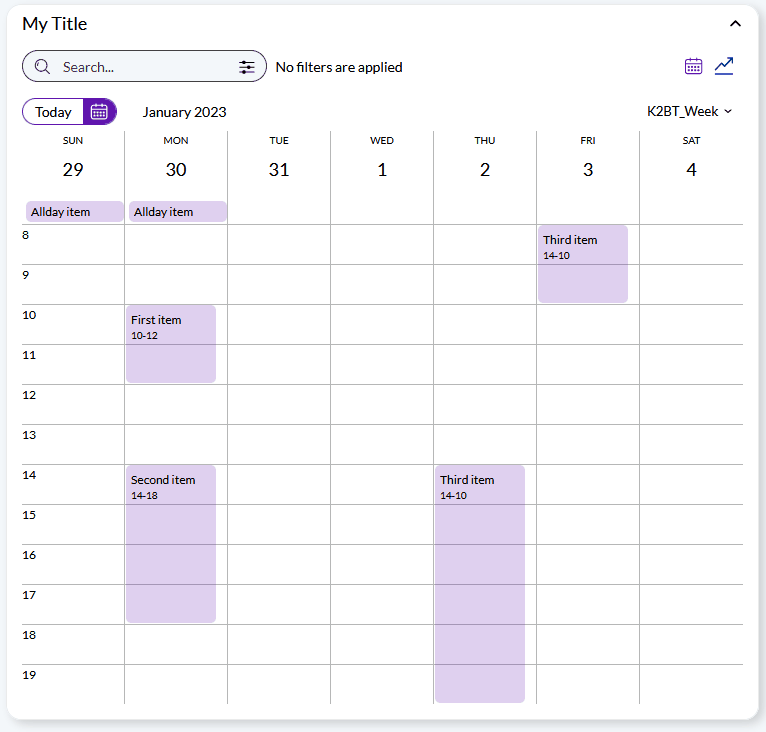 |
| Example combining both views |
| Category |
Name |
Value |
| General |
Control Name |
The components's control name. Must be unique within the web panel. |
| Title |
The title associated with this component (may be empty). |
| Icon |
The icon that should be shown alongside the component's title (may be empty). |
| Collapsible |
Determines if the component will be collapsible in runtime. See Collapsible property for details. |
| Start Collapsed |
Determines if the component will be collapsed by default in runtime.See Start collapsed property for details. |
| Layout |
Contains a reference to the Basic Layout? object used to generate the web form associated with this component. |
Possible child nodes for this node are:
|