|
In K2BTools 10.2 we focused on a series of items we believe will improve the UI of applications generated with K2BTools.
The first one is the specification of date filters: From now on, creating date range filters will be much easier. Also, creating “semantic” date range filters is now possible. Using this new filter type, the UI of the generated application is significantly improved. See the “Date Range Filters” section for more details.
The second is related to grid controls. From now on, K2BTools will persist the items selected in grids across grid refreshes (when the grid’s filters change, or when grid page is changed). This will positively impact the user experience in the generated application, as the end user can perform operations on the grid without losing the selected items. See the “Grid Selection Persistence” section for more details.
The third is specific to the Entity Services pattern. In this pattern, it is now possible to add “Multiple Delete” actions, that can be used to delete several records at once. See more in the “Multiple Delete” section.
Lastly, this version includes a new feature that enables end users to sort grids by clicking on column titles. This feature cohexists with the “Ordered by” combo box already present in previous K2BTools versions. A few improvements in the instance specification were needed to implement this feature. See more in the “Order-By on column click” section.
Aside from the main features outlined before, less significant features are described in the “Other features” section. As always, this version includes bugfixes found in the “Bugfixes” section.
When date filters are included in an interface, frequently the intention is to define a query over a date range, i.e.: the user should be able to select a time interval and the data shown should be included in that interval.
In previous versions of K2BTools, this could be accomplished using two filters: a “Date From” and a “Date To” filter.
In this version we chose to implement a new type of filter called “DateRange”, that will make this definition clearer and simpler to use. Also, when these filters are used, the end user UI can be improved to provide a more compact representation.
Currently, K2BTools supports two types of Date Range Filters: “Manual” and “Semantic”.
Manual filters are the simplest date range filters, generating a simple yet flexible UI that contains two date fields: The first specifies the start of the interval, and the second specifies its end.
 |
| Manual Filter |
Semantic filters can be more complex to specify, but allow the user to quickly select an interval from a list of predefined options.
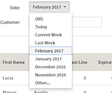 |
| Semantic Filter |
To use this kind of filter, the developer must specify the set of options that should be available in the filter. To do this, developers should think about the data that is shown in the grid, and the filter values that will be used the most.
To define possible values, developers should use the “Semantic Date Ranges” property. For each option, the developer must specify an internal name, that should be unique in the set, an expression to calculate the description, and expressions to calculate the “From” and “To” values, as shown below.
The developer can create intervals with no upper or lower bound if necessary.
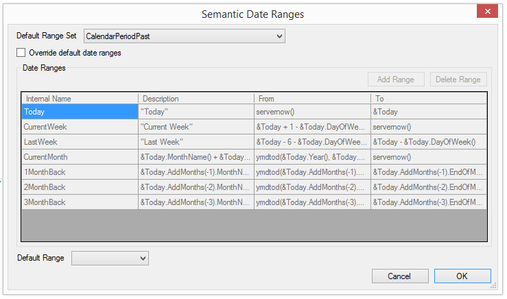 |
| Semantic Ranges definition |
To simplify this task, K2BTools contains a several default sets, that represent common values we’ve seen used in applications.
Those default sets can be edited in the “Default semantic Date Ranges” property in Web Panel Designer settings and General settings.
Aside from the options specified here, the developer can choose to include an “Empty Item” and a manual option.
 |
| Manual Option |
See more information in Date Range filters.
In many scenarios end users need to select multiple records and delete them at once. In previous versions of K2BTools, the developer had to implement a custom action to do this.
In K2BTools 10.2, the generation of this action is automatic. This action’s implementation uses the transaction’s business component. For that reason, the action is generated only if the base transaction is a business component.
When Multiple Delete is enabled for an instance, the delete action’s behaviour is the following:
If the user selected only one item, the delete action is executed as usual (calling the Entity Manager if Standard Edit Mode is used, or opening the transaction in a popup or in the web component if EditMode is Popup or TwoPane).
If the user selected several items, a confirmation dialog like the one below will appear.
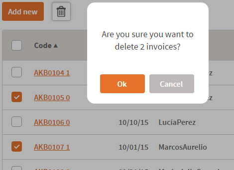 |
| Multiple Delete Runtime Appearance |
If the user confirms the action, the records will be deleted using the BC. If some records cannot be deleted all errors will be shown and the operation will be rollbacked.
The developer can customize:
- Whether to include the confirmation dialog or to execute the action directly when more than one item is selected.
- The confirmation, error, and success messages.
- The behaviour of the action when a delete fails: The action can rollback all deletes, or commit the successful ones.
See more in Multiple Delete actions.
In previous versions of K2BTools, when a grid was refreshed and the end user had selected items in the grid, the selection was lost. As the grid is usually refreshed when the user changes a filter value or navigates through grid pages, this behaviour was not user friendly.
In this version, K2BTools added to the load event of grids to ensure that the items selected by the user are maintained when the grid is refreshed. That includes when the user changes the grid’s page, and when the user changes a filter value.
This impacts how actions with “Row Selection” = “Multiple” may behave. In previous versions, the items used in these actions were the ones that were selected and visible in the current page (In fact, it was impossible to have selected items outside the current page). As the selection is now saved when the user navigates through pages, two possible behaviours are available:
- When the action is executed, it should apply to the selected items in the current page.
- When the action is executed, it should apply to all the selected items.
The developer may choose between any of these two scopes when creating an action. Generally, the first scope should be used when the action’s effect cannot be easily undone. In this case, the end user should be able to see which items are going to be affected directly in the grid.
When the second scope is chosen, the end user will not be able to see which items are selected when the action is executed. If necessary, the developer can add a confirmation message, and mention the selected items (or the amount of) in it.
Regardless of the scope chosen, K2BTools will generate code to display the action only when available, and to provide the action with the items specified by the scope. If the developer chooses to change the action’s scope, the code used to implement the action does not have to be updated.
In this version K2BTools includes an option to order grids by clicking on their columns. This ordering is performed in the server (using the entire dataset, not just the items visible in the page). As ordering large datasets can be a costly operation, K2BTools only generates this behaviour for columns specified by the developer.
In previous versions of K2BTools, the orders were specified as shown in the image below.
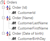 |
| Orders definition in previous versions |
This allows the creation of complex orders, where several attributes may be used in either direction (ascending/descending). However, if orders should be included for both directions for a single attribute, this specification can be cumbersome, as shown in the image below.
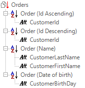 |
| Bidirectional orders example |
In this case orders for both directions exist for the “CustomerId” attribute. In K2BTools we saw two problems with this specification:
- The specification takes up a lot of space visually.
- Aside from the order’s description, the order’s direction is not obvious.
Because of this, we added a new type of node called “Simple Order”. This type of node allows the developer to specify an order involving only one attribute. Along with the attribute, the developer must choose if the direction should be ascending, descending, or both.
 |
| Simple Order node properties |
The “Order” node used in previous versions has been renamed to “Compound Order”.
Using “Simple Order” nodes, the specification above can be translated into the structure shown below.
 |
| Orders definition in K2BTools 10.2 |
As you can see, using this specification we can overcome the problems of the previous specification without losing flexibility.
Notes:
- When upgrading to K2BTools 10.2, instances will be automatically converted to use “Simple Orders” when possible.
- Compound Orders do not affect the generation of orders associated with columns.
Grid actions location in Web Panel Designer: In previous versions, when using responsive web design, actions associated with a grid were shown between the grid and its filters, on the left side of the screen. In web panels created with patterns, actions could also be generated on the right of the “Grid Settings” control.
In this version, actions related to a grid with Region = “Right” will be generated on the right of the Grid Settings control.
BC in K2BTrnForm: In this version it is possible to include BC variables in the Web Form directly, without using a User Region.
GeneXus 15:
- Switch control type is now supported.
- WebPanelDesigner part is now optional. When WebPanelDesigner is not used in a Web Panel, the part is not referenced when interacting with GeneXus Server or when generating Import/Export files.
- K2BEntityServices settings is commited to server only when there is a change in its visible properties.
The following errors were fixed:
- If a K2BTrnForm instance contained more than one grid inside a Column node, an “InvalidTargetInvocation” exception was thrown.
- UI improvements in Web Panel Designer’s Multiple Selection node.
- Actions with an associated permissions placed in a grid are were shown after a grid refresh.
- Actions in K2BTrnForm were aligned to the right of the container.
- “Add Grid From Data Provider” action threw an error when the output SDT had fields that were not based on an Attribute or Domain.
- Invite message was not working in varibles with TrnForm Pattern.
- Conditional combo actions were not shown when they should (only in GX15).
- Enhanced visualization of checkbox was lost after refreshing the grid (only in GX15).
- Empty cells appearing in pagination bar (only GX15)
- Evo3 and GX15
- K2BPrompt pattern instances with actions threw an "Unable to serialize data" error when using HTML UIs.
- K2BPrompt pattern, the Based On property in filters was set as optional. Now developer must set Based On property to all filters.
- Only GX15
- BC's in K2BTrnForm pattern using HTML UI threw an specification error when referring to a BC Variable by control name.
- BC Variables were not shown in responsive sizes properties in K2BTrnForm.
- General Tab with "UseTransaction" property different from "Always" using the UI Responsive wasn't shown properly.
- K2BTools setup was not installing K2BOrderBy user control when selecting only "K2BTools for Web" during the installation.
- Problems in RWD: In extra small size, the user was not able to click on the first items of the screen.
Note: We recomend using K2BTools 10.2 in GX15 U4 or later, or in GXEv3 U12 , U14 or later. If you are using other GeneXus versions (ex:GXEv3U13) please follow this link
- Install K2BTools 10.1 using the setup file downloaded in the previous section.
- If you were using a previous of K2BTools 10, you will need to update your licenses as described in Upgrading K2BTools licenses.
- If K2BTools licenses are not installed, install licenses as described in Requesting K2BTools licenses.
- Open GeneXus.
- If after applying the first pattern instance you get a "failed" error message then: follow these instructions
- If you have personalize layouts objects of the patterns, you will need to update them, in order to include conditionalconfirm section. A message will be given when applying K2BTools patterns. For more information follow this link.
If after updating all grids appear like this the image bellow is because you need to update your theme.
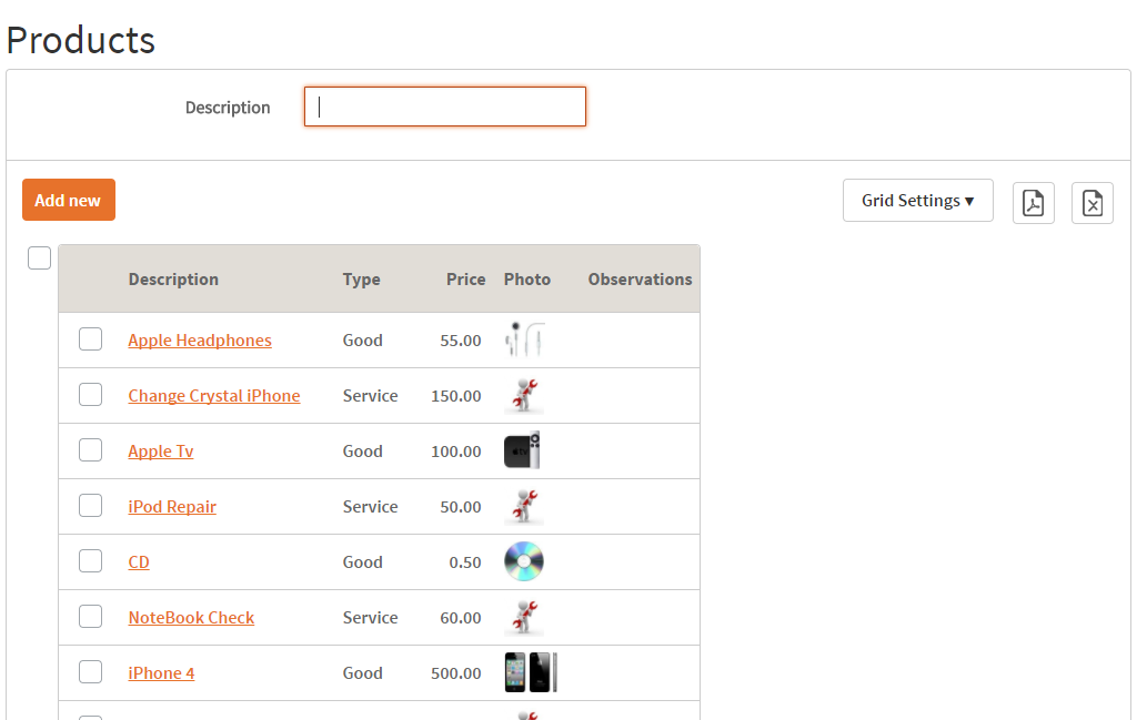 |
| Grid appearance upgrade issue sample |
If you are using K2BFlat theme (or one of its color variations) or K2BFlatCompact theme (or its color variations) the first time you apply K2BTools 10.2, a merge between the version in the KB and the version included in this version 10.2 is done. However, some modifications to the theme are not done. There are two ways to solve this.
- Importing the theme with “Theme Import Behavior” set “Overwrite” (modifications to the standard theme will be lost)
- Follow K2BTools theme changelog and update the classes that are not automatically merged. These are:
- K2BTools_CheckAllGrid
- Switch (only GX15)
- K2BToolsTable_GridContainer
- K2BToolsTable_GridSettings
K2BTools Theme Log can be found in these URLs:
|