In previous upgrades of K2BTools 10, we focused on improving the “WorkWith” and “SubWorkWith” interface, implementing the TwoPane and PopUp edit mode. In this version we worked in improving the user interface of the Entity Manager, and adding new edit modes to parallel and general components.
In K2BTools 10.4 we worked mainly in four fronts:
- Improving Entity Manager user interface
- Improving General and Parallel components UX
- Adding more flexibility in layout objects, to easily create new designs with K2BTools.
- Improvements in usability and flexibility of security
We also solved one of the problems GeneXus developers face when using grids in which calculating the total number of pages is not possible. We have improved the “Display Page Count” feature, giving the possibility to have the same user interface when “Display Page Count” is set to “False” (with the only difference that the total number of pages is not shown), an also adding this property to WebPanelDesigner.
Also several errors were fixed and some other minor features were added.
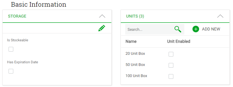
Up to this version, the Entity Manager was always structured in a UI with Tabs, each tab showing a part of the entity’s definition. In many cases, end users want to see all this information at once, without having to click on tabs or actions.
For example for a Product entity, users may want to see the general information, with its storage, units, categories and warehouses.
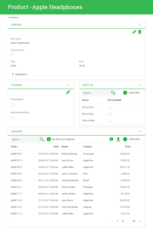 |
| Product Entity Manager |
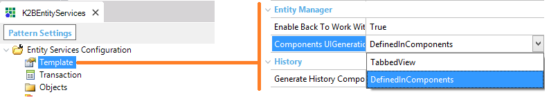
In previous versions of K2BTools when generating the Entity Manager the only way to show its components was using tabs, where each component was mapped to one tab. In this version we have added the option of showing several components at the same time.
The developer can specify a table where components will be shown, and determine if that table should be treated as a cohesive section or as a set of independent sections. Components can be grouped recursively. For example, one of the components shown in a table can, in turn, be composed of several components shown as tabs.
In order to enable this feature the developer must go to K2BEntityServices settings, template node and set “Components UI Generation” property to “Defined In Components”
 |
| "Components UI Generation" property |
Once the developer has done that, new possibilities of Entity Manager UX start to appear.
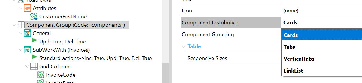
When you have a “Component Group” there are various ways to show its children. The way the components will be displayed will depend on the “Component Distribution” property. Its possible values are “Tabs” or “Table”.
 |
| "Component Distribuition" property |
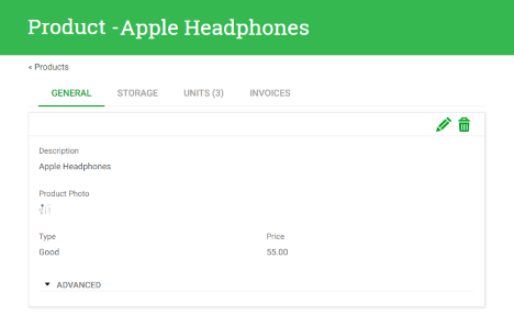
When we set the “Component Distribution” property to Tabs, each child of the “Component Group” will be shown as a tab.
 |
| "Component Distribution" set to tabs |
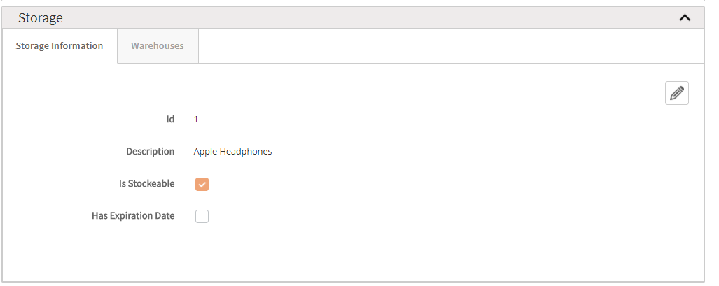
When the “Component Distribution” is set to “Table”, the children visualization vary according to the value of the “Table Grouping” property
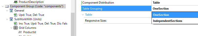 |
| "Table Grouping" property |
When using “Independent Sections” this is the visualization
 |
| "Table Grouping" set to Independient Sections |
The other possibility is “OneSection”.
 |
| "Table Grouping" set to One Section |
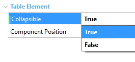
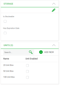
When the components have a parent other than tabs the “Collapsible” property will appear. The “Collapsible” property allows the components to be collapsed in runtime.
 |
 |
| "Collapislbe" property |
"Collapsible" property set to true |
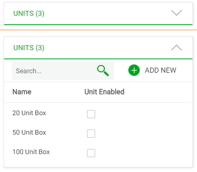
Also the developer can place several components on the same row using the “ComponentPosition” property whose possible values are “NewRow”, and “SameRowAsPrevious”.
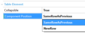 |
 |
| "Component Position" property |
"ComponentPosition" property set to "SameRowAsPrevious" |
The developer can also configure the responsive behaviour by changing the “Responsive Sizes” property that is available in “Component Group” nodes with “Component Distribuition” property set to “Table”
|
 |
| Entiy Manager in a large |
Entity Manager in extra small |
Finally you can add a component as a child of other “Component Group” to do something like this
 |
| Entity Manager with components as child of component |
As you may see we have given to the developer much more features in order to improve the Entity Manager User Interface.
For more information see:
As for the new feature of the Entity Manager that allows to have components grouped in sections, when performing an insert, update or delete action in a general and parallel sections, it is necessary to configure where the component that performs the operation will be shown.
To do that the edit mode property was added to “Parallel” and “General” nodes.
The “Edit Mode” property is located in the “Modes” node of “Parallels” and “General” components.
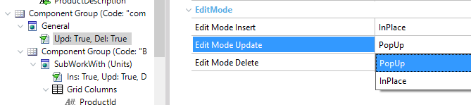 |
| "Edit Mode" property in General and Parallel nodes |
The possible values of this property are:
- PopUp
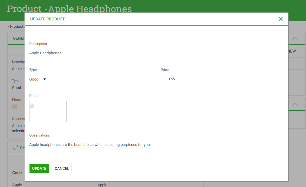 |
| "Edit Mode" property set to PopUp |
- InPlace
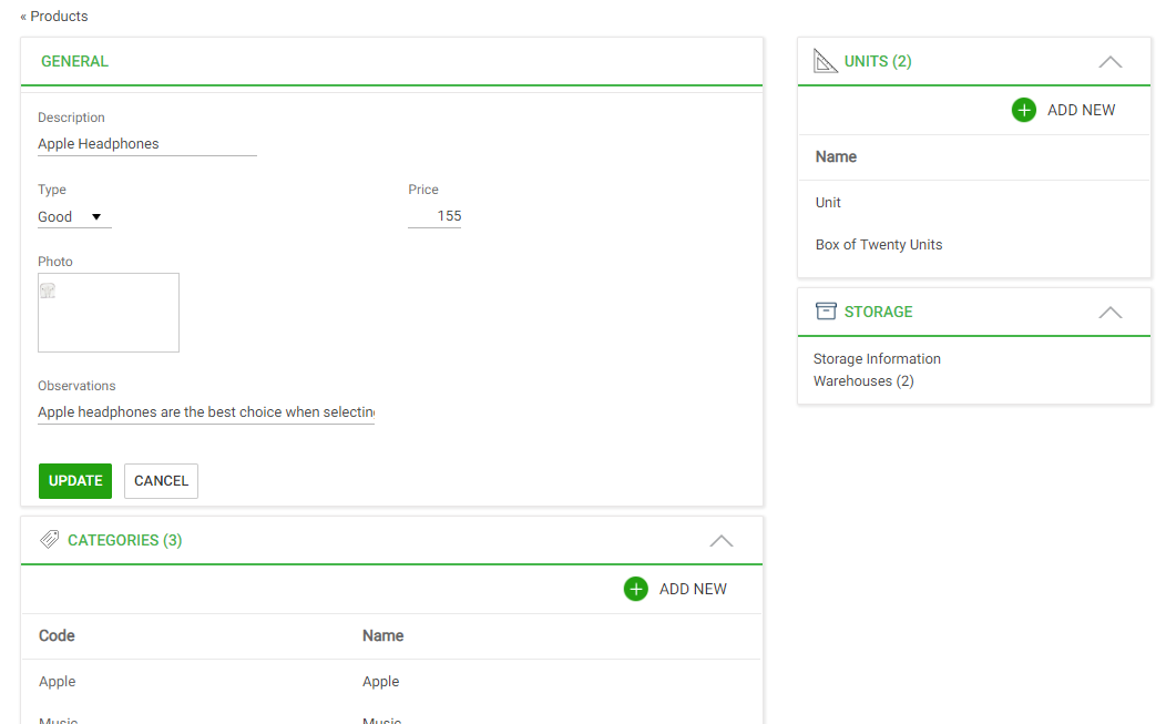 |
| "Edit Mode" property set to InPlace |
With the “Edit Mode” feature and the improved EntityManager User Interface users will not lose the context in which the operation is performed.
For more information see using edit mode in plain sections
In grids based on attributes, K2BTools uses the “Grid.PageCount” function in order to display the total number of pages the grid has. However, there are some scenarios where this function cannot be calculated or in which performing the operation can impact system performance.
In previous versions of K2BTools, K2BEntityServices and K2BPrompt Patterns had a “Page Count” property that allowed the developer to define a grid using GeneXus' standard paging.The problem with this option was that those grids' UI would be significantly different from the rest. In this version we changed the property's behaviour to overcome this problem.
In this version The following changes were made:
- The property is now called “DisplayPageCount”
- When set to “False” it continues to use K2BTools paging, without showing the total number of pages.
- The property is now available in WebPanelDesigner when defined grids based with base tables.
For more information see using display page count property.
In K2BEntityServices and K2BPrompt all security properties were added to actions.
 |
| Action node security properties |
With these properties the developer can have more flexibility when defining user actions.
Also in K2BTools patterns a security check is now performed to decide if the autolink will be shown or not.
Finally some security procedures were added in order to encapsulate some logic currently used in the default master page. For more information read this.
WebPanelDesigner Basic Layouts were improved so all code added in the events parts is automatically added to all web panels based on them.
Additionally in all responsive basic layouts in the “WebForm” Part, developers can add a new Table called “FilterGlobalTable” that will be included only if the related grid has filters.
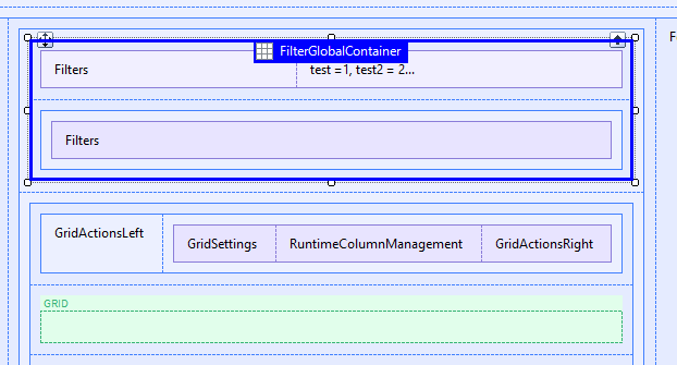 |
| Layout filter global table |
Also in the events code an “//+ If.Filters” slot can be added and all code inside this slot will only be added grids with filters
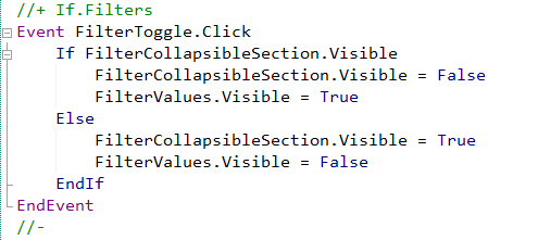 |
| Layout object if filter event code |
This enables developers to create new user interfaces. For example you can add filters in a collapsible region. For more information read using events in basic layout objects
Finally in basic layout objects we have added the possibility to add a summary textblock, that summarizes all filter information, useful when the filters are collapsed.
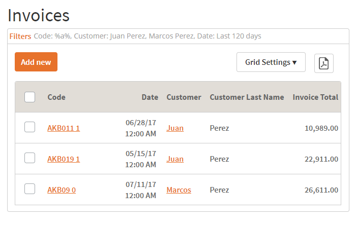 |
| Example of Filter Summary section |
For more information read using filter summary
These functionalities are added for flexibility purposes and are not currently in default layout objects.
- Theme Classes associated with Cancel and OK buttons in confirm actions can be customized in General Settings and WebPanelDesigner settings
- Theme Class associated with Save Grid Settings action can be customized in General Settings and WebPanelDesigner settings
- In WebPanelDesigner developer can add the same variable multiple times. For more information see using use existing variable property
- Usability improvements in generated objects adding comments between code added in events node
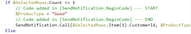 |
| Code added by developer in pattern instance |
- In patterns it’s possible to add a variable based on a collection. The “Is Collection” property is available in “Vairiable Definition” node.
- Performance was improved in the check all action . When pressing check all the grid is not refreshed.
- Performance was improved in K2BTools User Controls.
- Hide date range filters or multiple filters was not working.
- Descriptions related with variables, attributes and filters with left text, right text or descriptions on top were not hidden when the "Visible" property was set to "False".
- In K2BTrnForm pattern, attributes and variables inside a FreeStyle Grid with “Visible” property set to False were shown.
- In K2BTrnForm pattern BCNodes variables with visible set to false were shown.
- Grid variables with “Visible” set to False where shown in K2BEntityServices and K2BPrompt patterns.
- When using multiple delete in a subworkwith in which the primary key is not present in the grid a specification error was shown. In this version a warning will be displayed and the multiple delete feature will be disabled.
- “Business Component” nodes was not properly defined when the transaction was in a module.
- SDDesigner:
- SDPanels with actions threw a “Property Manager cannot be null” error.
- Error in generation of “TextBlocks”.
- When applying the K2BEntityServices pattern variable “IsAuthorized” was not overwritten if the variable was based on a domain.
- In RWD grids with many attributes the grid overlapped its container. In this version an horizontal scroll is added to prevent this.
- Actions with “RefreshGrid” property set to “True” and “Target” property set to “Popup” were not refreshing the grid.
- Invisible filters were shown in PDF reports.
- “Searchable” set to “True”, was not supported for transactions inside a module.
- The multiple delete feature was not correctly defining the business component variable when the transaction was inside a module.
- In WebPanelDesigner, order nodes default caption was not shown correctly.
- LoadSelectedRows subrutine were unnecessary generated in some scenarios.
- Autolinks were not working when the transaction's Entity Manager belongs to a module.
- In Responsive Sizes properties it was not possible to set the "label width" of a field.
- Semantic filters with labels on top showed its description multiple times.
- ComboActions showed its title as an item of the combobox control.
- Fixes in combobox rendering (first item was being shown in combobox actions and it shouldn't).
- Object reference not set to an instance of an object in GXServer in GetConditionalRowClasses (fixed).
- Improvements in EntityManager generated code in order to avoid SAC #42234. (Edit popup mode was not working when using encrypt url parameters).
Note: We recommend using GX15 U4 or later.
- Install K2BTools using the setup file downloaded in the previous section.
- If you were using a previous of K2BTools 10, you will need to update your licenses as described in Upgrading K2BTools licenses.
- If K2BTools licenses are not installed, install licenses as described in Requesting K2BTools licenses.
- Open GeneXus.
- To enable the Entity Manager improved UX functionality go to “K2BEntityServices Settings” “Template” node and set “Components UI Generation” property to “Defined In Components”.
- If you are using K2BFlat theme (or one of its color variations) or K2BFlatCompact theme (or its color variations) the first time you apply K2BTools 10.4, a merge between the version in the KB and the version included in this version 10.4 is done.
- If you are using another theme please follow the theme log
|