|
In this version a new Visual Design, called “K2BOrion” is shipped with K2BTools.
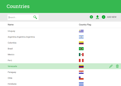 |
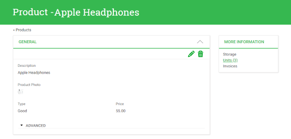
| Work With interface generated with K2BOrion |
This is our second iteration in Responsive Web Design, involving a redesign from the ground up. We learned a lot from our experience with K2BFlat, and we’re using this new design to fix problems we found in that Visual Design. Because of that, we expect developers to be more productive when using this design to create RWD applications.
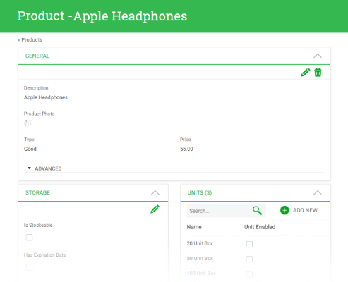 |
| Entity Manager interface generated with K2BOrion |
This is the default Visual Design for new Knowledge Bases, and existing KB’s can be upgraded to this theme using the “Change K2BTools UI” action. K2BFlat is still maintained, so it’s up to the developer to choose when to upgrade to the new version.
Some key differences between applications generated with K2BFlat and K2BOrion are:
- Space is used more efficiently, allowing developers to show more information in the same space as before. We expect this to simplify the creation of complex business applications.
- Attribute descriptions are shown on top of the attribute by default when using K2BOrion.
- The UI is now organized using cards to separate different areas of the interface. As a result, Entity Managers have a significantly better design in the new version.
- Filter summaries are now included by default in the UI for Work Withs, Sub Work Withs and Grids (in Web Panel Designer).
- This layout includes a Generic Filter by default (more on that below).
- The “Export” and “Report” actions have been relocated to a “Downloads” menu.
To start using this use the Change K2BTools UI action
In this version we added a lot of features to grids developed using K2BTools. These features include more options to define filters, and improvements in the generated UX.
Grids may now include a Generic Filter. This filter behaves as a “String Search” filter but is given a special position in the UI, separate from the rest of the filters. As an example, the UI given to the generic filter in the K2BOrion theme is shown below.
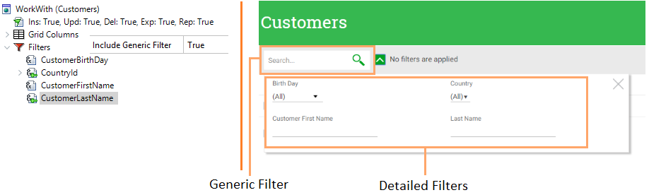 |
| Generic and detailed filters |
The developer can still create filters for individual attributes as in previous versions. To distinguish between the generic filter and the filters defined for specific attributes, the latter are now called “Detailed” filters.
The Generic Filter can be configured in the Filters node. In this node the developer can choose if the generic filter should be included or not, the “invite message” shown in the filter, and the attributes that should be involved in the filter’s condition. As you can see above, the changes in the instance’s structure are minimal.
We expect that the generic filter will be sufficient for many work withs. Because of this, in many cases the developer may choose to delete all the detailed filters. This scenario is supported by K2BTools. The developer can also choose to create a grid with detailed filters and no generic filter.
Note: Generic filters are only available when the selected Basic Layout object supports their existence. Currently, only K2BOrion supports it out of the box, but K2BFlat can be extended to support it as well.
See more information in Filters
In this version the filter summary feature was extended to support the definition of an “Empty State” message when no filters are applied, and to show the descriptions (and not the values) of filters based on enumerated domains.
 |
| Filter summary shown in runtime |
See more in Filter Summaries.
Default condition for enumerated domains in String Search filters: When using the “Condition Attributes” property (both in String Search filters and the Generic Filter) the developer can select enumerated domains, and the generated condition will search over the domain’s descriptions instead of its values.
Default value for “Multiple filters”: When using multiple filters, the developer may wish to set the default selection that will be used when the user first interacts with the grid. To do this, the developer has two options:
- Select the values statically in design time.
- Implement a “Default Provider”, that will be executed to load the default values in runtime.
The first option is suitable for filters based on enumerated domains, as the values are known in design time. The second one is better in cases where the default value cannot be known in design time, typically because the values themselves are loaded from a database table in runtime.
To implement the first option, use the “Default filter (Comma-separated expressions)” property. To implement the second option, use the “Default value provider” property
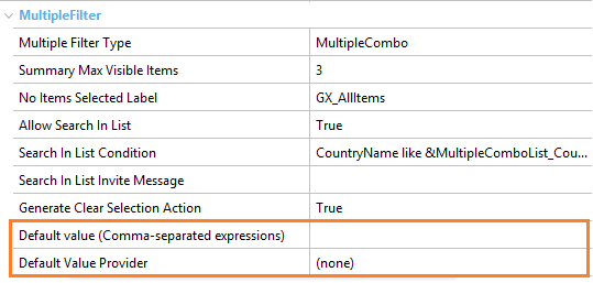 |
| Multiple filter default values properties |
In this version, when all the orders in a grid can be mapped to a grid column the order by combobox will not be generated. For this to happen, the following conditions must be met:
- The grid must not be a Free Style grid.
- All the defined orders must be “Simple Orders” and not “Compound Orders”.
The developer can choose if the combobox should be generated or not in these cases using the “Show Order By When Only Simple Orders” property.
See more in Orders.
In previous versions, the user could select which columns were visible in each grid, and the amount of grid rows. These values were stored in the user session, and K2BTools provided places were the developer could extend this feature to persist these values in the application’s database.
In this version, we created a standard module that allows the developer to implement this feature effortlessly, by importing a XPZ. This module includes a backend for advanced users where the default behaviour for each grid in the system can be configured. Advanced users can also define rules to define the which columns should be visible in all grids.
See more in User preference persistence module.
In K2BTools 10.4, the Entity Manager’s user interface was updated to support new ways of showing the EM’s components. In this version we have worked in refining the improvements introduced in K2BTools 10.4.
Using this distribution the developer can create groups that will be generated in runtime as shown below.
 |
| Link list runtime appearance |
Basically, the titles for the groups’ components are shown in a card. Each title is a link that allows the end user to open the component in a popup interface.
Groups with this distribution cannot contain other groups. We expect this distribution to be useful in cases where the Entity Manager contains a significant amount of components, and some of those components are not used often. Those components can be grouped in a link list group, and that will use less space in the interface while allowing the end user to access the component’s content.
See more in Component Group in Entity Manager.
Components have been updated to support three new properties: Icon, Title Attribute, and Title Expression. The first can be used to define an icon for a component, that will be shown alongside the component’s title.
 |
| Components icons and titles |
The Title Attribute and Title Expression properties allow the developer to define dynamic titles for the components, which are calculated in runtime.
See more in Component group.
Note: these properties are not supported in components shown as tabs.
Now General components can reference a Web Component that will be shown instead of the transaction or the attributes defined in the component. The developer can choose which of the three options (Transaction, Attributes, or Web Component) should be shown when opening the component in an “Edit” mode (Insert, Update, Delete), and when opening the component in the “Display” mode.
To select the web component the developer must use the “Content Web Component” property. To select which component to use in each case, the developer must use the “Content In Edit Modes” and “Content In Display Mode” properties. These properties replace the old “Use Transaction” property. The migration between the old property and the new ones when updating K2BTools is automatic.
The parm rule in the selected web component must match the parm rule in the referenced transaction.
 |
| General with web component |
Performance: To avoid extensive page load times, in this version we improved the component load algorithm to only load the components visible when the user enters the entity manager. Invisible components are loaded once they become visible.
Configuration: The “Edit Mode Insert”, “Edit Mode Update”, and “Edit Mode Delete” properties can now be configured for the entire KB in K2BEntityServices settings.
K2BMenu was updated to support the creation of two types of menus: menus that are meant to be defined in design time, and menus that are meant to be defined in runtime.
In the first case the pattern generates a procedure that loads the menu for the logged in user, checking the user’s permissions before loading each item. This was the procedure generated by previous versions of K2BTools, and is now called the “Static Load” procedure.
In the second case, the pattern generates a procedure that loads all the menu structure onto an SDT. This SDT includes the information about the permissions associated with each item. This procedure is meant to be used to initialize a database with the menu’s structure. Because of that, this procedure is called the “Initialization” procedure.
A single K2BMenu definition in the KB can be used to generate both procedures at the same time. This can be useful as the menu defined in design time can be used while the database-based menu is not initialized. Once the database-based menu is initialized, the design-time defined menu is no longer used.
The developer can choose, for each menu, which procedures should be generated.
To integrate the defined menus in your application follow these guidelines.
Starting with GeneXus 15, GAM has supported the creation of menus in its database. Using this feature, the end user can define the application’s menus manually.
In the Fast Start GAM module we have implemented two features:
- Loading the menus defined in K2BMenu instances in the GAM database.
- Showing menus defined in the GAM database using the K2BAccordionMenu User Control.
The first one works using the initialization procedures created using K2BMenu. To access this feature, use the “Menus” option included with Fast Start GAM and use the “Load Application Menus” action.
The second one is implemented using a series of procedures to convert the GAM menu to the SDT used by the K2BAccordionMenu implementation. If using the default Master Page included with K2BTools, this should work automatically. If you created a new Master Page, contact our support team.
Get the new Fast Start GAM version here.
- In Modes (WorkWith), a new property was added to enable the Display action associated with the “Description Attribute”. The developer can choose which display actions should be shown.
- When the display action is associated with the description attribute, K2BTools now uses a link whenever possible instead of an event. This allows the end user to open the link in a new tab.
- Basic Layout objects now support the addition of event code that should be copied to the generated object. The developer can add conditions so that some code is only added in certain scenarios.
- Reapply K2BTools actions were redesigned to be easier to use.
- Now K2BTools only imports the themes used in the application, to optimize the KB’s size and accelerate the first usages of the pattern.
Bugfixes
- K2BTools no longer uses “ToFormattedString” when saving Date filters state.
- Orders associated with VarChar columns now show A->Z instead of 1->10 in their descriptions.
- The “Item Value” and “Sort Description” properties are now being shown correctly in the Control Info node in K2BPrompt pattern.
- Variables defined inside Patterns that were based on a Domain belonging to a different Module were not being created correctly.
- In Multiple Selection interfaces, when using Smooth User Experience and Automatic Refresh, the “Check All” feature was not working for the “Selected Items” grid.
- When using Edit Mode = InPlace for all actions in an Entity Manager, an application error was thrown. This version supports having Edit Mode = InPlace for all actions.
- In K2BTrnForm, the default value for the Empty Item Text is now “GX_EmptyItemText”.
- Other minor bugs were fixed. If in doubt, contact K2BTools support team.
Note: We recommend using GX15 U9 or later.
- Install K2BTools using the setup file downloaded in GeneXus Marketplace.
- If you were using a version earlier than K2BTools 11, you will need to update your licenses as described in Upgrading K2BTools licenses.
- If K2BTools licenses are not installed, install licenses as described in Requesting K2BTools licenses.
- Open GeneXus.
- If using one of K2BTools’ default themes, they will be updated automatically. If the KB contains unused K2BTools themes, the developer will be asked if those themes can be removed. We strongly encourage to delete unused themes.
- If you are using another theme please follow the theme’s changelog.
- To start using K2BOrion use the Change K2BTools UI action
|