- GeneXus 17 U3
- GeneXus 17 U4
- GeneXus 17 U5
- GeneXus 17 U6
The focus of the version is to:
- Enhance the UX of mobile native applications by improving the K2BTools SD generator.
- Improving the UX of responsive web applications:
- By adding new controls that will provice a better user interface to the end user.
- By adding more features to the standard grids.
Our focus was to improve the generated UI while simplifying the tool’s initial configuration.
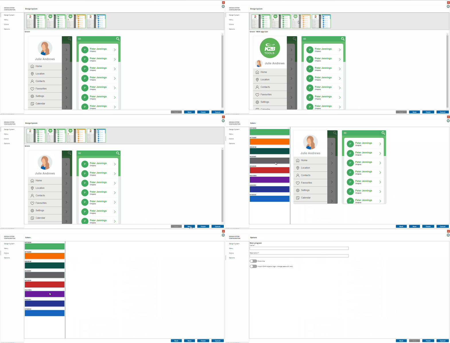
The wizard serves the same purpose as the Web version, configuring the UI of a native mobile application created using K2BTools.
The developer can choose from several predefined design systems and use them as is or, as a starting point to create a new one.
In the following steps the developer can customize the selected Design System, changing the menu UI, and the color palette.
 |
| Mobile Design System Configuration |
In the last step the developer may define the name for the main program that defines the application and some other options. In particular, the developer can choose to import a login object if GAM is present in the Knowledge Base.
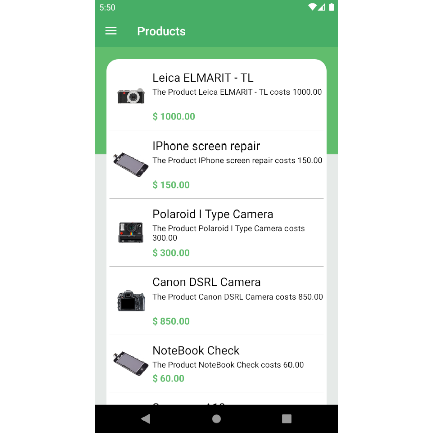
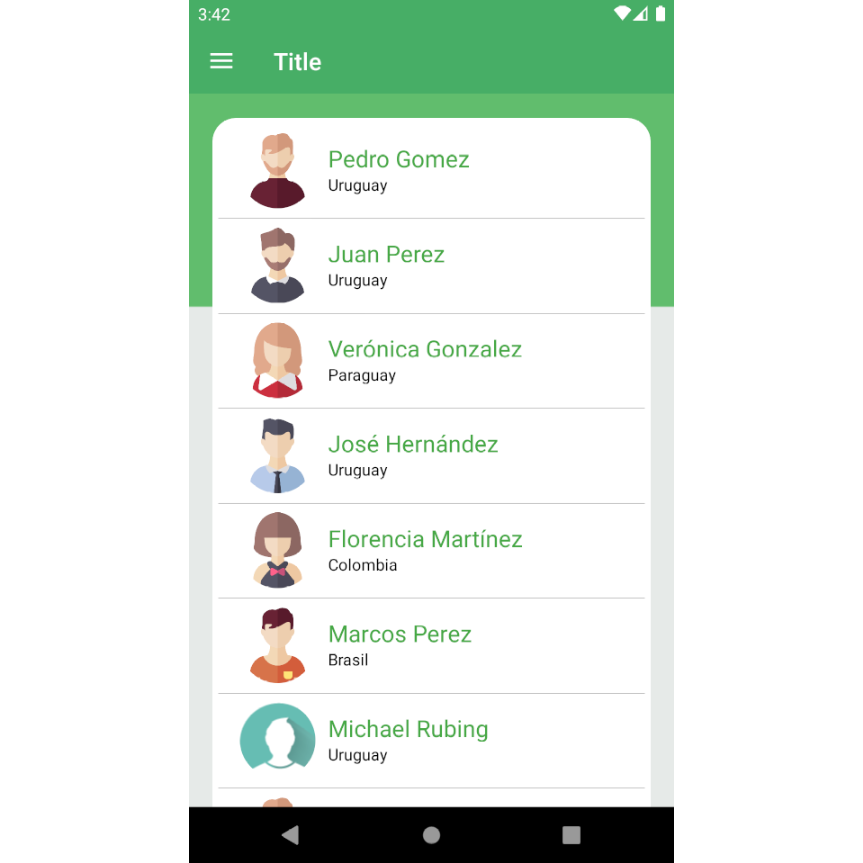
This version also includes a renewed design system, aligned with the Orion design system used by K2BTools for the Web environment. In this version we also include several new layouts for different kinds of panels.
See some samples of this design below.
 |
 |
| Sample 1 |
Sample 2 |
 |
 |
| Sample 3 |
Sample 4 |
Previous versions of this tool involved some manual initial steps to start using it. In this version we automated all those steps, some of which are:
-
Setting the theme for each platform.
-
Creating and configuring the main object.
-
Integrating GAM objects (login, change password, etc).
-
The developer can now choose the height for grid controls.
-
LayoutContent nodes can be created manually now (without calling an “Add attributes from...” action)
This version adds new options to the “Control Type” property. They provide new, more user friendly ways for the end user to input data.
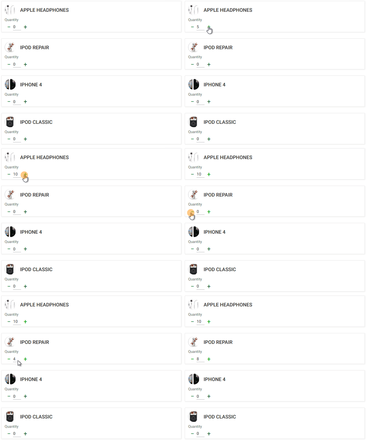
A new Stepper control type was added to K2B Tools. It is visually similar to an edit that is sorrounded by a minus and plus buttons. Input can be typed in or incremented/decremented using the buttons.
See Stepper control type for further details.
 |
| Stepper UI |
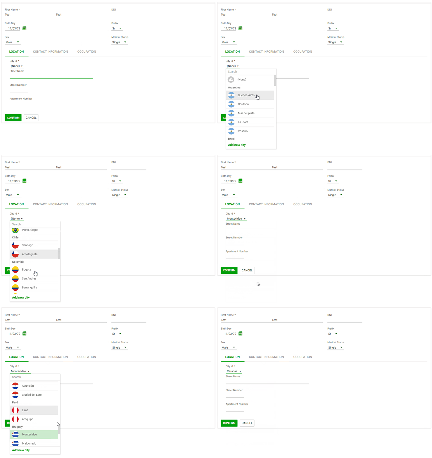
A new Dynamic combo box control type was added to K2B Tools. It's a standard Dynamic combo box on steroids! Combo items can be categorized and have many optional elements like an image or a description. The Combo can be searched and items can be added without losing context. See Dynamic Combo Box control type for further details.
 |
| K2B Tools Dynamic combo box |
Some grids do not need the “Grid Settings” dialog, mainly when they are simple grids with few columns and/or rows.
In previous versions, to disable the dialog, all the features that are included in it had to be disabled.
In this version the developer can disable it explicitly using the “Generate Grid Settings” property.
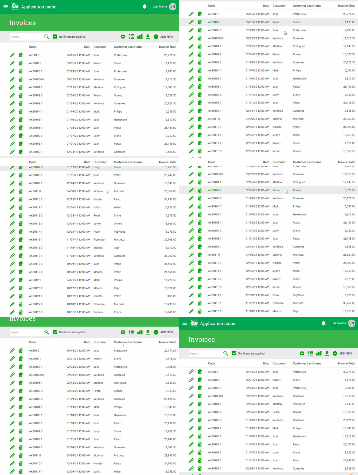
When vertically scrolling a grid with many lines, column titles scroll off the screen, making it hard for the application user to identify what value is what.
Freezing column titles helps solve the above situation as they stay visible regardless of the scroll position.
 |
| Freeze column titles UI |
Using the Freeze column titles property, the developer can control if grid titles can be frozen and who can freeze them.
Possible values are:
-
Never: Column titles scroll off the screen
-
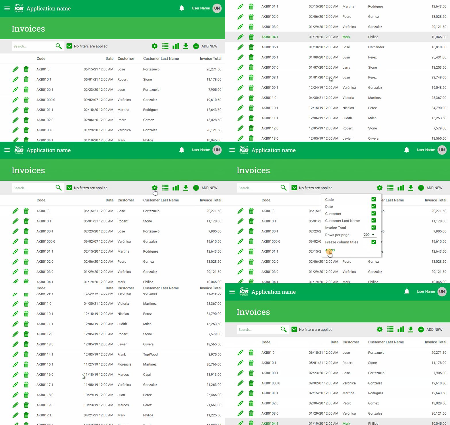
Runtime: The application user can choose whether freezing or not column titles in runtime. A check box is added to the Grid settings dialog.The application user can select the behavior by checking or unchecking it. This value is NOT available if the Grid Settings dialog is disabled.
-
Always: Column titles are always frozen.
 |
| Freeze column titles selection in runtime |
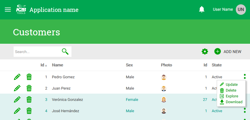
When a grid has many actions at the row level, the developer may like to group some or all of them to save horizontal space. Moreover, grouping can depend on the screen size. A given action can be shown in the row in specific screen size(s) and moved to the group in other size(s).
 |
| Overflow menu sample |
The above action group is called an Overflow menu. To control where a given action is shown the developer uses the Move To Overflow Menu property.
Possible values are:
-
Never: Action is never moved to the overflow menu. This is the default.
-
In Extra Small: Action is moved to the overflow menu in the ExtraSmall screen size.
-
In Small and lower: Action is moved to the overflow menu in the ExtraSmall and Small screen sizes.
-
In Medium and lower: Action is moved to the overflow menu in the ExtraSmall, Small, and Medium screen size.
-
Always: Action is always shown in the overflow menu.
When creating filters with Type = Multiple it is now possible to use Data Source From = DataProvider. This applies to MultipleCombo or TagsCollection filters.
In previous versions the only way to achieve this was to refresh the entire panel. In this version the developer can use the optimized option described in Refreshing Entity manager components.
In this version we included some improvements in the integration between K2BTools and GAM. We worked on updating the login web panels to adapt them to changes in GeneXus 17 Upgrade 3, and also improved support for Single Sign-on (SSO) and Identity Provider (IDP) scenarios.
In the configuration backend we improved how roles are configured, allowing the user to change permissions’ access type for permissions already present in the role.
The “Design System Configuration Wizard” was renamed to “Web Design System Configuration Wizard” to separate it from its mobile version.
Several options were added to the wizard. This forced us to split the “Typography and spacing” step into 3 sub-steps to keep them simple.
The new options are listed below
-
Title fonts and sizes are now customizable for cards, line separators, and tabs.
-
The “text transform” (uppercase / none) property is now available in all customizable fonts.
This property defines the borders included in editable fields. Current options are Underline (default value) and Rectangle.
This property defines how the corners of the editable fields are shown. Current options are Square, Rounded Small, Rounded Medium, and Rounded Large.
This property defines if the fields’ width is defined by their type or by their container.
See how these properties work below.
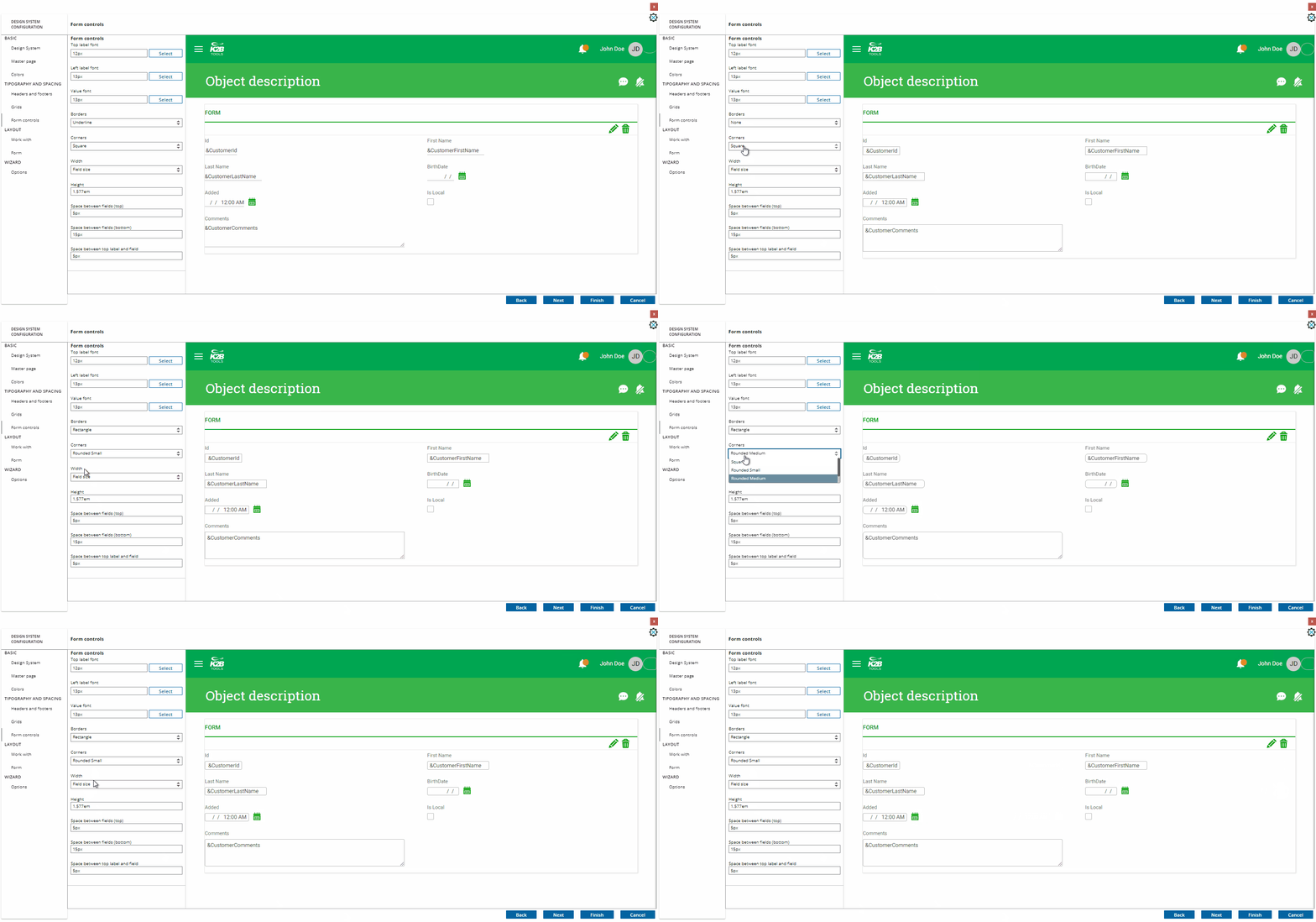 |
| Form controls configuration |
We are always working on improving the experience of developing applications with K2BTools. In this version, we focused on the features described below.
K2BTools automatically generates several standard actions, such as Insert, Update, Delete, Export, and Report.
The Standard Actions node is the first node shown in WorkWith and SubWorkWith nodes. Using this node the developer can specify if standard actions should be included in the web panel and how they should behave.
In this version, we reorganized the properties in this node to make them easier to use, and we also renamed the node to Standard Actions (dropping the old “Modes” name) to make its purpose clearer.
Before:
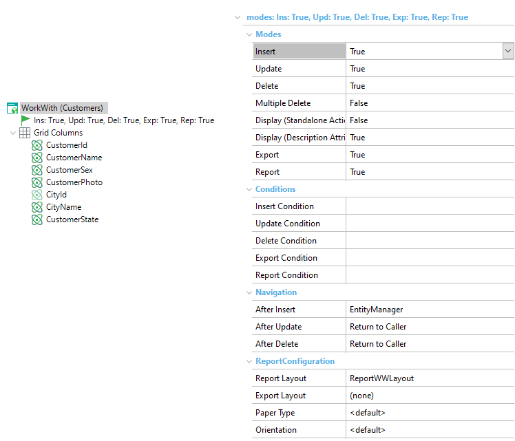 |
| Modes node in previous versions |
After:
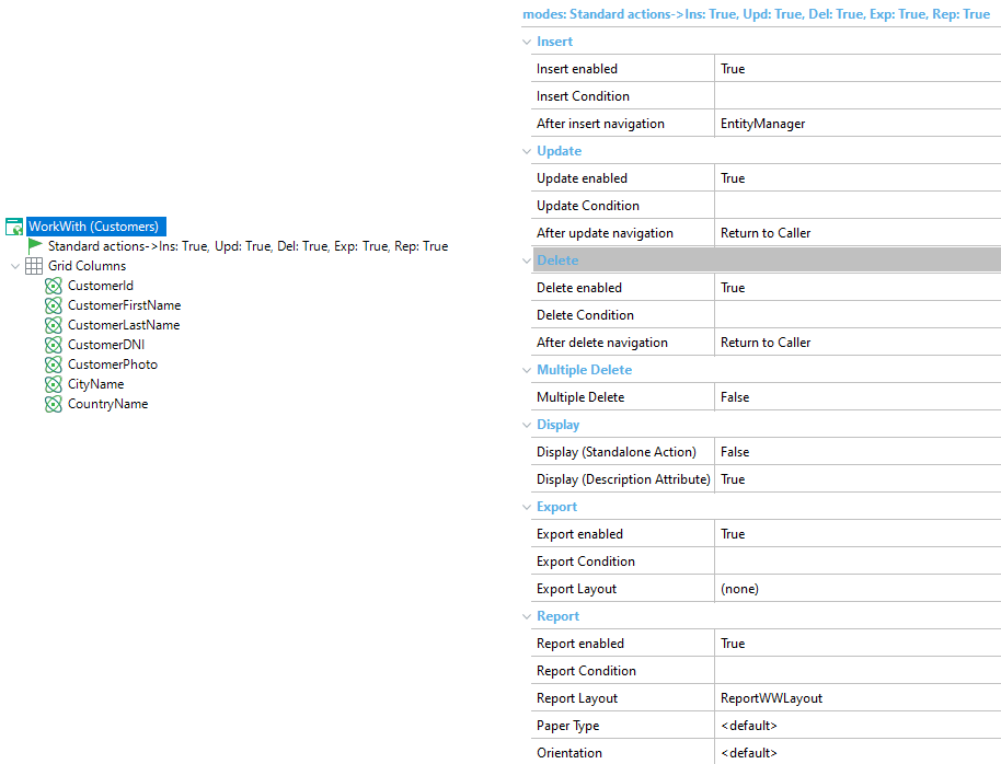 |
| Modes node in this version |
The values for the “Component Distribution” property in Component Group nodes were clarified: “Table” was renamed to “Cards” and a new “Vertical Tabs” option was added.
Renaming “Table” to “Cards” reflects more clearly the result of choosing that option, we expect this change will make the property easier to understand.
The “Vertical Tabs” creates this UI:
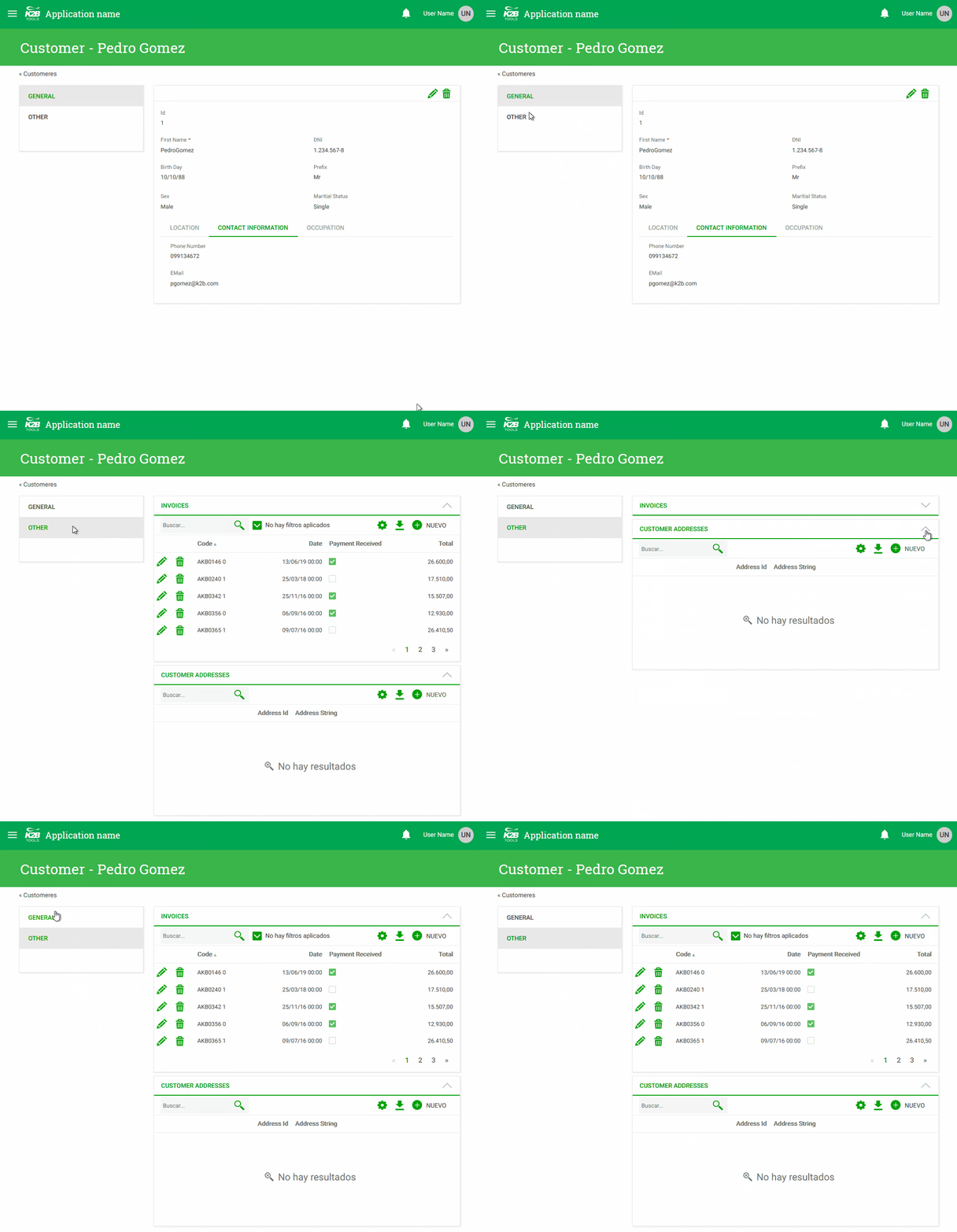 |
| Vertical tabs |
This UI could be created using previous versions of K2BTools, but the process was more complex.
The accuracy of the generated preview was improved. Using the “Show Preview” action, the developer can see how the UI will look like in the generated UI without building the app.
Having the best performance possible when developing apps is very important to everyone. In this version we included several improvements that should improve how our tools perform when editing the KB and also when generating the application.
After the “Generic Filter” was introduced a few versions ago, many grid interfaces started using this filter only as detailed filters were not needed.
In this version we changed how default filters are generated when creating new grids or pattern instances: If the heuristic used to create filters returns only one filter and the underlying attribute is already included in the generic filter, only the generic filter is included in the grid by default.
If needed, the developer can include any number of filters as in previous versions.
-
An asterisk is now shown in required attributes.
-
Export files are now generated using X-Frame-Options: sameorigin
-
We optimized how changes are applied in the KB after saving changes done in the Design System Configuration wizard to avoid unnecessary pattern instance applications.
-
Integration issues between K2BAudit and K2BTools solved.
-
Class names in Web Panel and SD Designer properties were not sorted alphabetically.
-
Grid selection in grids with selection keys containing numerics with decimals did not work.
-
Multiple Combos based on an enumerated domain were not shown correctly.
-
Grid aggregations in pattern grids did not use the data selector specified in the instance.
-
SD Designer: Control Info nodes were not processed in SDT Variable nodes
-
SD Designer: A “layout with incorrect identifier” warning was shown when saving panels.
-
SDT Variables did not validate the Field Specifier
-
Update SD Panels: If panels are open when this action is executed errors were shown to the user.
-
RBGA colors were not processed properly in the Colors step inside the Web Design System Configuration wizard.
-
The Web Design System Configuration wizard did not update the Description Layout property for filters in Web Panel Designer.
-
The Web Design System Configuration wizard did not update Responsive Layout property in Web Panel Designer.
-
The “Company Logo” option in the Design System Configuration wizard was not working properly.
-
When migrating from previous versions of K2BTools, the K2BHome panel was restored to its original version.
-
In some configurations the Login object in the GAM Integration Module required a CAPTCHA but it did not present it to the user.
-
Unnecessary permissions were created for Basic Layout and Dynamic Layout objects.
-
All standard actions had the function key F2 assigned to them.
-
All web panels were created with an unnecessary reference to the DefaultGridSettings object.
-
Export actions in Web Panel Designer did not support layout objects with variables.
-
Variable nodes were not supported in Layout grids inside pattern instances.
-
Some labels in the grid settings control were not translated by default.
-
An error occurred in Web Panel Designer when Runtime column selection was enabled for a grid but disabled in all columns.
-
The TrnForm pattern did not support having an attribute and a variable with the same name.
-
Type of parameters (in, inout, out) was specified for K2BTools basic objects to avoid compilation errors.
-
Numeric Range Filters with Input Type = Slider did not support numerics with decimals.
-
Entity Services instance validation failed when the instance did not contain a Transaction node.
-
A compilation error occurred when Display Page Count = False and Rows = 0 (no limit) in pattern instances.
-
The Check All option was hidden after a grid refresh.
-
A validation error occurred when saving a pattern instance with Inline Editing where a variable was present in the grid before the transaction’s primary key.
-
The Inline Editing mode failed when the PK was not present in the grid or the grid had boolean attributes.
-
Secondary grid views were not ordered as the primary view.
-
Performance improvements in javascript code included with K2BTools.
-
UI errors occurred when using checkboxes with control titles.
-
Generic filter height was incorrectly set when there was no space available for the control.
- BugFixes
- Export Layout: Variables based on External object or SDT were not defined in generated object.
- Unexpected end tag (System.xml): The error was thrown when using overflow actions in WebPanelDesigner
- Design system configuration: preview was not updated separation between top label and field.
- Server error in Application: Could not find a part of the path ... Vdir/BinGeneXus/Packages/K2BTools/MobileDesignSysmteConfiguration/MobileDSCMetadata.xml
- Install K2BTools using the setup file downloaded in GeneXus Marketplace.
- If K2BTools licenses are not installed, install licenses as described in Requesting K2BTools licenses
- If K2BTools licenses are installed but in a version lower than 13.0, an upgrade of the licenses is required as described in Upgrading K2BTools licenses
- Open GeneXus.
- To upgrade a Knowledge Base to K2BTools 13.1
- Open the Knowledge Base
- In the GeneXus Development Environment Menu Bar, select K2BTools ->Reapply K2BTools and Build.
- Update the theme if needed. Updating a K2BTools theme to a new version
- If updating the GeneXus version from a version lower than GX17 U3, upgrade the GAM Integration Module or follow the steps of Migration of GAM Integration Module to GX17U3 or higher
- If the K2BTools User Preferences Persistence Module is installed, the module must be updated. More information in User Preferences Module must be updated
- Once this process have finished, you are ready to enjoy the new features of K2BTools 13.1.
- In any doubt contact support team: support@k2btools.com
You can download the files, and copy them, in the GeneXus root directory or the GeneXusServer instance. After that perform a GeneXus.exe /install in the command line in case of a IDE installation, or restart application pool in case of installing in GXServer.
- GX17 U3 U4 U5 13.1.1.15262
|