Status: Released
- K2BTools 14.0.1
- GeneXus 17 U8
- GeneXus 17 U9
- K2BTools 14.0.2
We continue to add to K2BTools the features that are provided by the design system object, adding a dark variant of the Orion Design System.
Additionally we added new control types that will enhance the user interface generated by K2BTools.
As in each version the Design System configuration wizard is improved with more options.
We also included the possibility to create Web Panels in an easier way (yes, easier than now with the Web Panel Designer!) by providing a wizard that allows to create Web Panels based on different templates.
But that's not all: we made big improvements in forms definition by improving the old "No Skip" property, and added a great feature for importing data, the Import from CSV.
So, let's take a look at the all new features that come with K2BTools 14, so you can add it to all your Knowledge Bases.
A new "dark" version of the K2BOrion design system is available. It can only be enabled when using the Design System object option. The developer can enable the dark option in the Design System Configuration wizard.
When enabled, the user can change the selected color pallete in runtime.
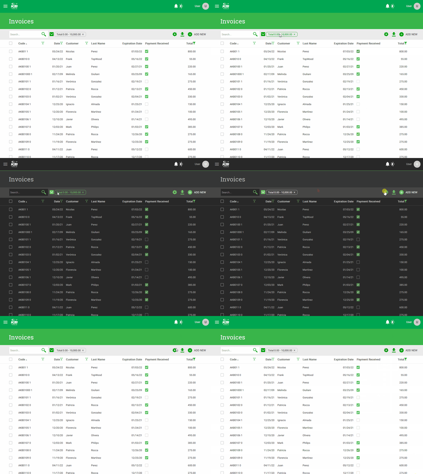 |
| K2BOrion light/dark versions |
This version includes an extended version of the suggest control type that allows the developer to define a suggest UI with the same features as the Dynamic Combo Box control type released in previous versions.
It supports:
- Adding an image to the item.
- Adding secondary texts to the item (detail and trailing texts).
- Enabling an "Add new" button to support cases where the user can't find the item that he wishes to select.
 |
| Suggest in runtime |
The masked input control type allows the developer to define a mask defining the accepted format or formats for the values entered by users. The control in runtime behaves just like a regular edit control, but it rejects all inputs that do not conform to the mask.
This is useful in many cases, such as:
- Formatting government-issued documents.
- Formatting phone numbers.
- Formatting ZIP codes.
- Formatting license plates.
For more details see Masked input control type.
The numeric input control type was designed to improve how a numeric attribute/variable's picture is applied when entering values in a form.
Instead of applying the picture after the user leaves the field, it is applied progressively as the user enters data.
We chose to use the picture to define the format in this control because this allows the developer to keep a consistent formatting for values regardless of where it is displayed.
When using this control type, the developer can choose if the decimal separator must be explicitly entered by the user or if its location should be inferred from the amount of numbers typed by the user.
 |
| Decimal separator input = Explicit |
 |
| Decimal separator input = Implicit |
For more details, see Numeric input control type.
The image region selector control type was designed to solve many scenarios with a common structure: The user is presented with an image where several regions exists, and the user´s task is to select one of those regions.
Some examples found commonly in applications are:
- Selecting a seat in an airplane.
- Selecting a seat in a theater.
- Selecting places in a parking lot.
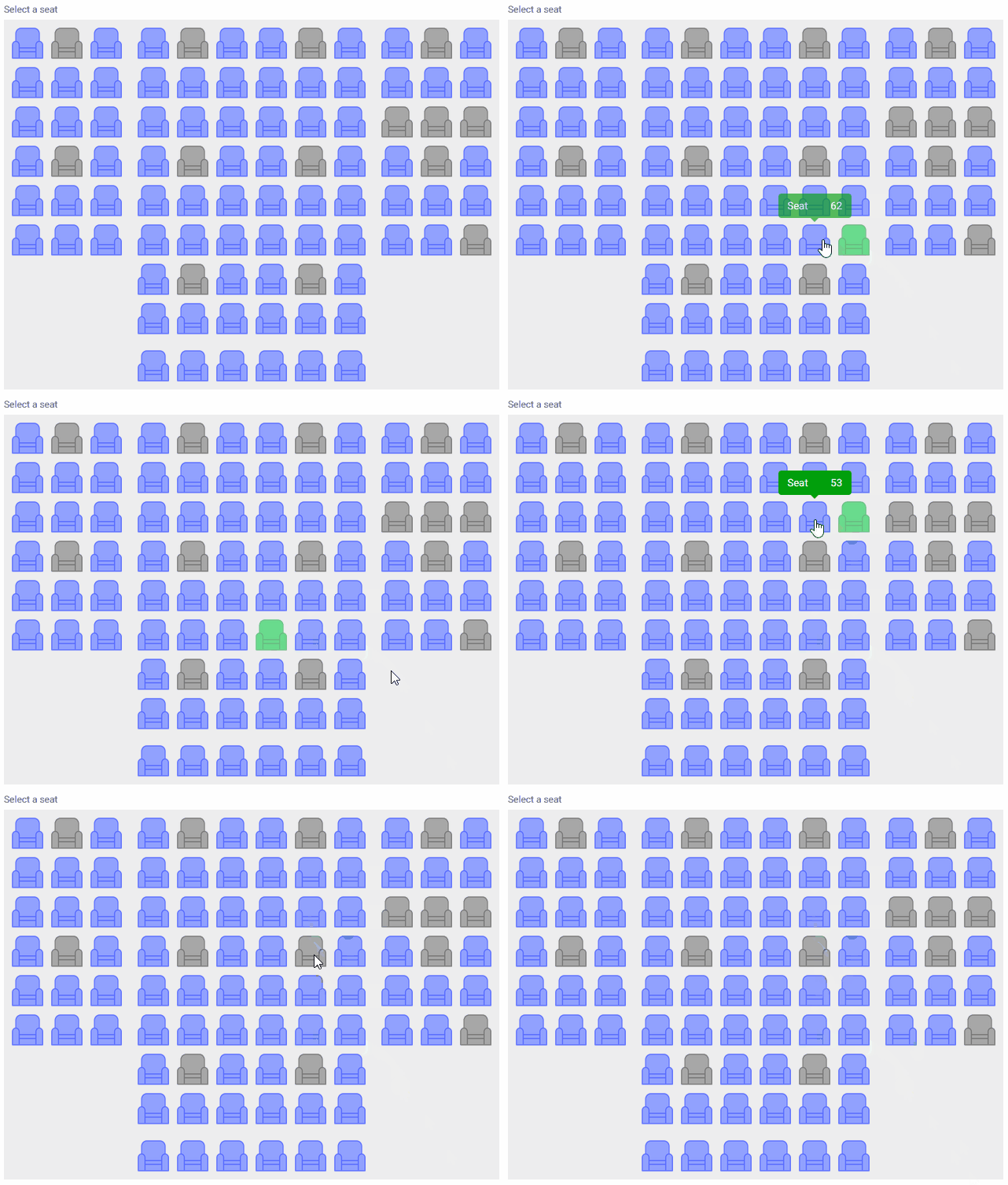 |
| Image region selector in runtime |
For more details, see Image Region Selector control type.
Many options were added to the Design System configuration wizard that make developer's life easier.
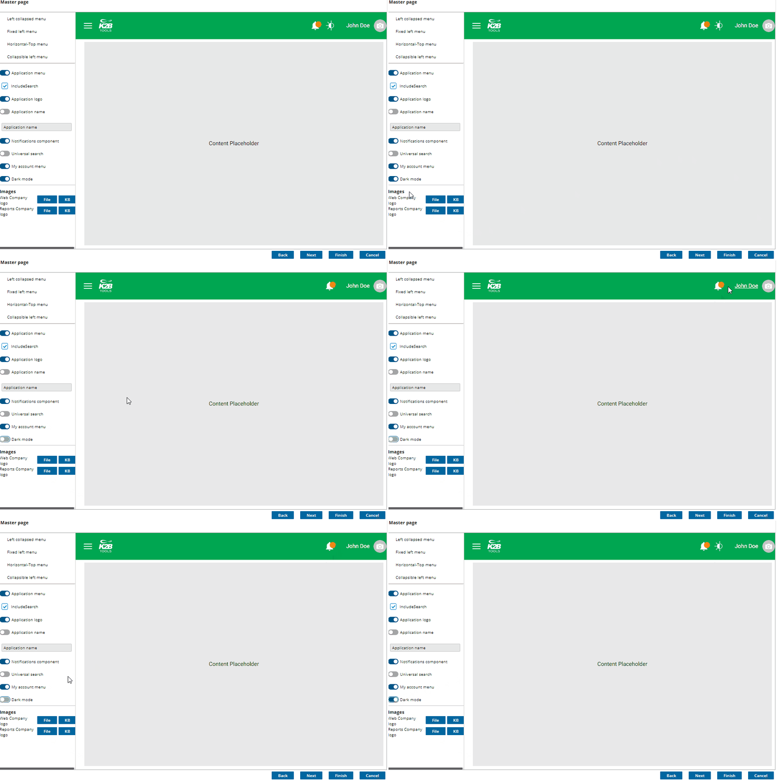
- Master pages can now have a dark/light toggle
If the application requires light/dark color variants, the developer can turn this switch on and all code required is added to the master page and generated objects.
- Colors page was reorgnized.
Color schemes were moved to a combo box. Major colors are shown first and specific colors in their corresponding groups.
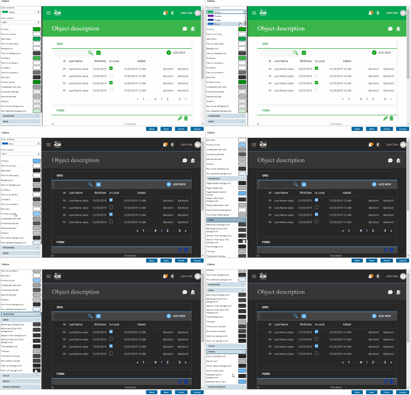
- A dark variant was added to every color scheme
The developer can change colors for each variant.
- Grid readability can be improved
Different colors can be assigning to even and odd rows and/or add a thin line between rows.
Hover and selected menu option background and text changed to improve menu readability.
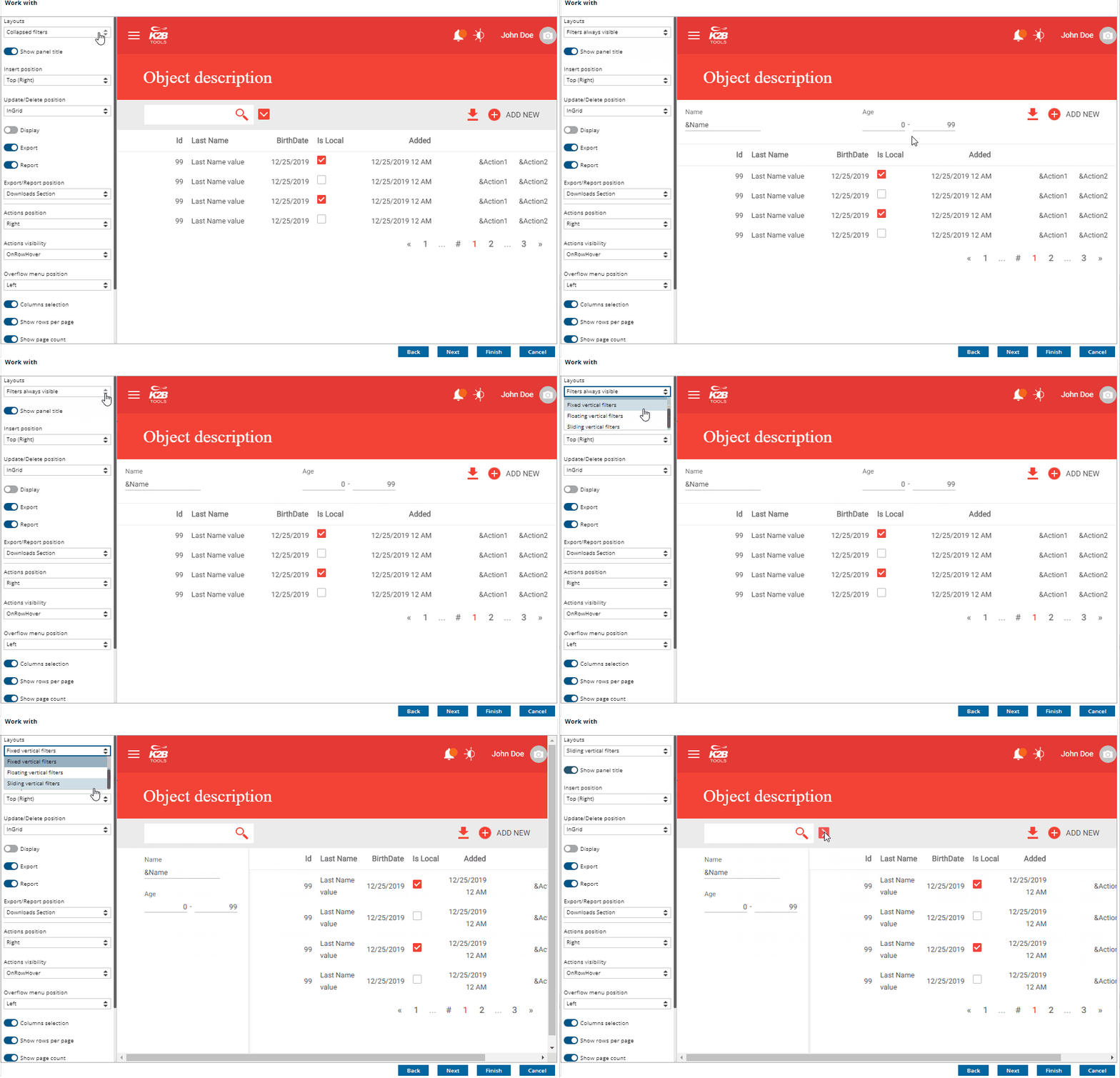
- Customize left floating, left fixed or left collapsible filters.
Many designs require the filters to float or be fixed on the left of the grid. The developer can choose the default filters position and change it in each instance as required.
Reset style options is new to this version. It is intended to restore all design related objects to its default (as deployed by K2BTools).
When using K2BTools to create user interfaces, the developer can use and combine several properties to tweak the UI to its needs. We've simplified this, by selecting the most common combinations of these properties and presenting them as templates when activating the Web Panel Designer in a WebPanel. The developer can now use a simple UI to select which user interface needs (list, detail, edit, wizard) and which template should be used. We think this will flatten the learning curve and help developers discover new features in each K2BTools version.
This change impacts the dialog to activate the designer. Now the developer can choose between:
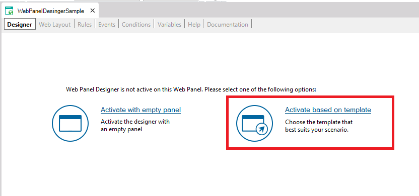 |
| Activate WebPanelDesigner based on template |
- Activate with empty panel: The empty panel with only the WebForm node that was generated in previous versions.
- Activate based on template: A dialog will appear in which the developer can choose the panel type, the base object, and the template.
When the "Activate based on template" option is selected a dialog will appear in which the developer must first select the panel type and its base object.
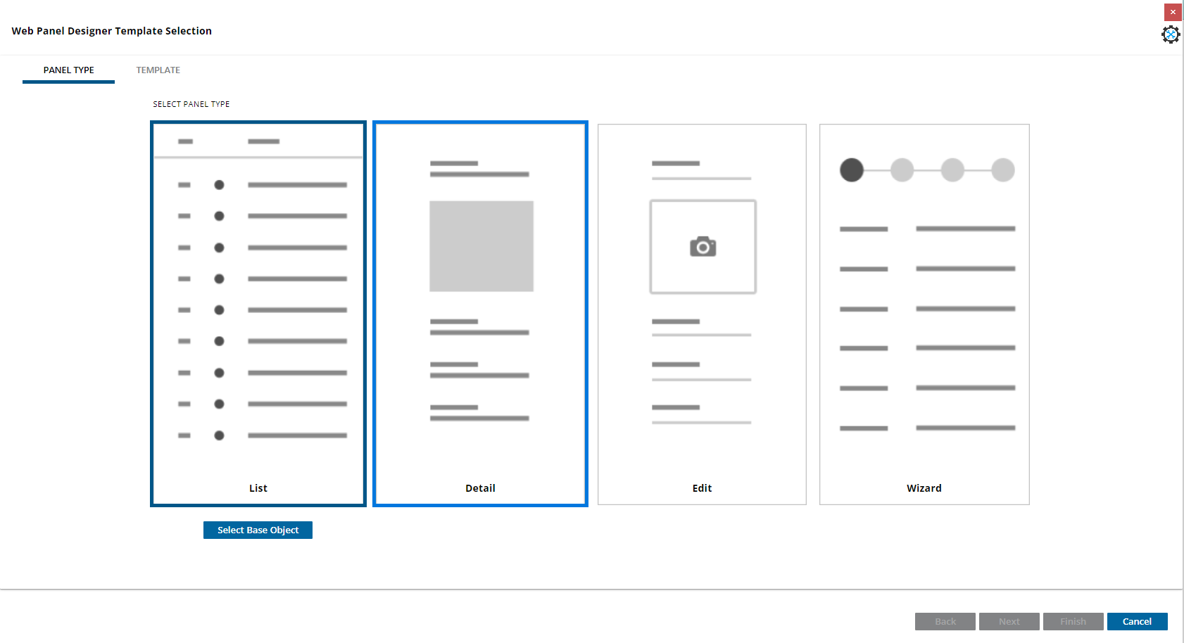 |
| The panel type step |
Then depending on the PanelType selected, a template selection dialog with a real time preview will appear in which the developer can choose the template that best fits its needs.
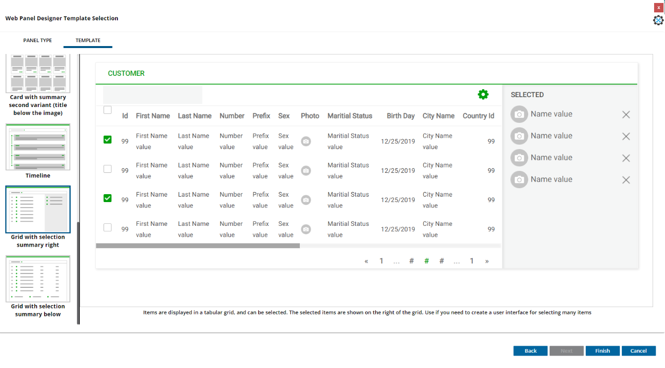 |
| Template Selection Step for list panel type |
When designing forms, there is the we need to place ogranize elements in a new rowthe screen, or by separating rows, and grouping elements in the same row of the previous elementthose rows. This was done in previous versions of K2BTools with the NoSkip property. However, once the element is placed in the same row, there was no easy way to configure whether the element is close adjacent to the previous element or in a new separate column, separeted by the Responsive Sizes property of the container node. To improve this, and make more clear this definitionsdefinition clearer, the NoSkip property has been changed to replaced by the "Element Relative Position. The " propetry, whose possible values are:
- New row: same as NoSkip = "False"
- New cell: same as NoSkip = "True", but will always generate a new cell. There were some cases for example when the element had an empty description, that it was placed close to the previous element.
- Same cell : The element will be placed close to the previous element.
This is an example of the Element Relative Position set to Same Cell, where the ProductDescription is close to ProductId, as ProductDescrption has Element Relative Position set to "Same cell"
 |
| User interface using "Same cell" |
The old NoSkip No Skip property will be automatically converted to Element Relative Position. Thils will improve the flexibility K2BTools provides in form generation as well as providing the developer with a definition that is better understood more easily. For more information read Element Relative Position property
The import from CSV action allows the end user to select and upload a CSV file containing records that should be imported in the application's database.
It can be enabled in grids with base transactions that can be used as a Business Component. To enable the action in those cases, use the "Import from CSV enabled" property in the Modes (WorkWith) or Grid (WPD) node.
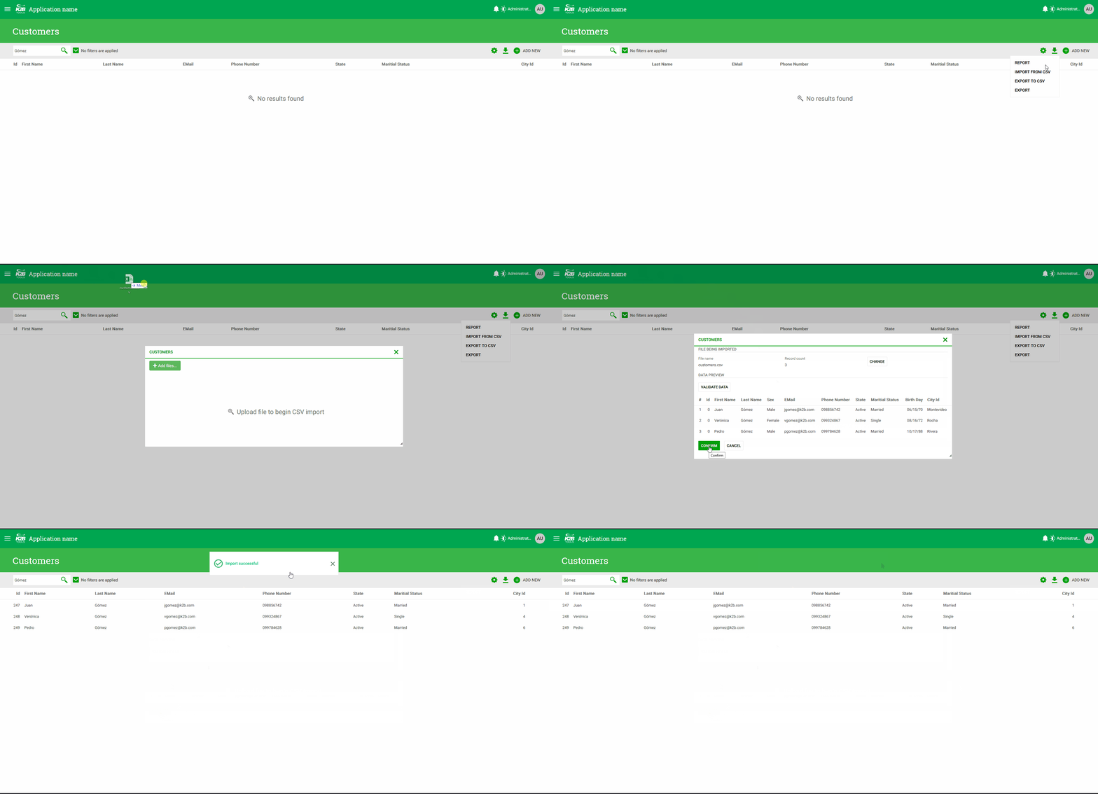 |
| How it looks in runtime |
Before inserting the data contained in the CSV file, the user is presented with a confirmation screen showing the values read from the file, so that the user may confirm that the data is correct.
In some cases users may wish to change the order of the columns shown in a grid. This is frequently used in cases where many users access the same UI with different goals. Changing the column order, along with showing/hiding columns, helps the user tailor the UI to their particular needs.
In K2BTools it is possible to enable this feature using the Allow Runtime Column Reorder property. This property is available in the general settings object and in the grid columns node.
The property in the general settings object can be used to configure the default value for the entire KB, while the property in the grid columns node (that uses the former as its default value), can be used to override that preference for a specific grid.
If the feature is enabled, the user can drag and drop the column headers to change the position of the columns.
 |
| Column drag and drop |
For more information see Runtime column reordering.
- The GAM integration module's backend was updated to simplify some actions:
- It is now possible to view which users are assigned to a role in the role's definition.
- When assigning roles to a user, it is possible to filter the list by the role's description.
- The unique clause is now available in grids with a base table or an inferred for each.
- The "Use 90 Transaction Prefix Compatibility" property's default value is now "False". This should simplify the creation of new KBs. Migrated KBs will retain the current behaviour, the developer can change it if desired.
- The "K2BEs.Key" slot can now be defined as a Fixed slot using the "Generate Fixed Slot For Key" in K2BEntityServices Settings
- The search option in menu user controls now ignores accents to simplify its usage.
- The filter summary now takes into account the underlying attribute's picture when displaying a numeric filter.
- The title class can now be customized whe nusing the card user control (attributes sections, grids, entity manager components, etc).
- Grid paging is now available when including an SDT in the interface with a non-collection root level and a grid based on one of its sublevels.
- Sub work withs nodes now contain an "Open related transaction" action to navigate to that transaction.
- When using control types provided by K2BTools the automatic refresh feature is now implemented natively by GeneXus.
- In the collaboration module message templates can now be defined for different languages, the module uses the one belonging to the user's language when creating a notification.
- The Grid.Refresh event is now supported in SDT grids.
- Starting in this version, the Install GAM Integration module is only available in KBs using Responsive Web Design. We recommend using the default GAM backend in that case (if the backend was not imported in a previous version).
- The GAM Integration Module was updated to Genexus 17 Upgrade 8.
User controls deprecation: Some User Controls were deprecated and will be removed in K2BTools 15.0. Migration to an equivalent User control should be automatic in most cases. See User controls deprecated in K2BTools 14.0 for details on how to check your KB for usages of the User Controls and see if manual actions are required.
Modules support: Up to this version, K2BTools supports having no modules in the KB (besides the "Root Module"). This means that users migrating from old versions can continue to work without modules, which is necessary in some cases to preserve the URLs as they were in those versions.
Starting in K2BTools 15.0, this will no longer be possible as we will import modules with our basic objects to improve the quality of KBs generated with K2BTools and their modularization.
We recommend using the URL rewrite object to preserve current URLs that msut be accesible after migrating to 15.0.
Breaking change: The ComboboxValueChanged and ToggleValueChanged events were removed in this version, we recommend using the equivalent ControlValueChanged instead. See ComboboxValueChanged and ToggleValueChanged events deprecated in K2BTools 14.0 to check your KB for usages of the deprecated user controls and see if manual actions are required.
We recommend that you check the steps defined in each feature to ensure a smooth migration going forward.
- Fixed problems when reapplying patterns after renaming an attribute in the transaction's structure.
- The preview action did not work correctly when the UI included ActionGroups inside grids.
- The error "Icon invalid property" was shown when an Entity Manager contained a Component Group shown as Vertical Tabs containing another Component Group with the Icon property set.
- Web panels created using web panel designer included a reference to the K2BToolsNumericRangeProviderSample procedure, even if it was not used in the panel.
- When creating a filter using a GUID attribute, the default condition used a like operator not supported by GX for that type.
- The error "'UpdateVisibility_Combo' is an undefined subroutine" was shown in KBs not using Responsive Web Design.
- Performance improvement: Global Events are now checked/updated only once after applying a pattern instance.
- The Design System configuration wizard did not update the grid actions position for sub work with interfaces.
- The Design System configuration wizard did not update K2BActionReferesh image color.
- The Textblock option appeared twice in the Add menu in some nodes in web panel designer.
- Performance improvements in the contextual menu opened inside the Web Panel Designer editor.
- When using the wizard initializer for pattern instances, the "Apply pattern on save" checkbox was not set automatically.
- To avoid confusion, Web Panel Designer can no longer be activated in objects generated by patterns, in Basic Layouts, or in Master Pages.
- The separator line between the menu and the panel's content did not stretch until the end of the screen in some cases when using a fixed menu on the left side of the screen.
- Filter summary UI was shown incorrectly in extra small.
- Conditional row/cell classes were not working correctly when using the Design System Object.
- Images inside grids were incorrectly underlined in grids.
- The check all option disappeared after executing a search.
- The "spacing between fields" property was not set correctly when using the Design System object option.
- The generic filter is not shown correctly in UIs with selection summary.
- UI errors in the Selection summary tabs option were fixed.
- Image attributes used in grids inside TrnForm were not assigned the class Attribute_Image_Grid automatically.
- Overflow menus did not work correctly if its containing grid has scroll.
- Action with conditions and Move to overflow menu = Always are shown in the overflow menu always (the condition is not taken into account)
- Toggle / Dynamic Combo K2BTools control types did not support GUID attributes / variables.
- The UserAddRole is now using the K2BSecurity permission as the rest of the security backend.
- The No results found label's visibility was not set correctly in grids with an inferred for each.
- Actions with confirm inside a free style grid did not work correctly (the &GridKey_ variable used to save wich row was clicked was not set).
- Errors in the remove action of Multiple Selection nodes were fixed.
- The export action condition was not processed correctly.
- The User preferences module failed when the Program Name, User Code, or Tenant Code were larger than 20 characters.
- Javascript performance improvements were introduced in this version.
- Action groups were not working in grids based on SDTs.
- In grid loaded using Dataproviders, changing filter values did not reset the current page to the first one.
- When using the control type "Dynamic Combobox K2BTools", if the user uses the search option but doesn't select an item the variable is set to null.
- The overflow menu does not show the correct image as the toggle button in the grid row when using the Design System object.
Translation
- The confirmation dialog was not processing the OK/Cancel literals correctly.
- Strings in the creation and handling of modal windows were marked as non-translatable.
- Strings in default Master Pages were marked as non-translatable.
- Strings in the K2BToolsMsg procedure were marked as non-translatable.
- Install K2BTools using the setup file downloaded in K2BTools download center
- If K2BTools licenses are not installed, install licenses as described in Requesting K2BTools licenses
- If K2BTools licenses are installed an upgrade of the licenses is required as described in Upgrading K2BTools licenses
- Open GeneXus.
- To upgrade a Knowledge Base to K2BTools 14
- Open the Knowledge Base
- In the GeneXus Development Environment Menu Bar, select K2BTools ->Reapply K2BTools and Build.
- Update the theme if needed. Updating a K2BTools theme to a new version if using Theme object.
- Update desing system object if using Design System Object (see section below)
- Once this process have finished, you are ready to enjoy the new features of K2BTools 13.
- In any doubt contact support team: support@k2btools.com
The design system object provided by K2BTools in this version is significantly different from the one distributed in K2BTools 13.2. The differences were needed to support the new "dark" mode, and to solve several issues that were present in that version.
We recommend executing the Web Design System configuration wizard after migrating to the new version to get the new version.
To customize the Design System object we recommend following these instructions. If this was not done in the previous version, you may find that some customizations are lost after the migration. If that happens, we recommend checking the object's history to find the manual customizations and reapply them using the recommended mechanism.
If you find any problems in the migration process you can contact our support team at support@k2btools.com.
- K2BTools 14.0.2 19545 , K2BTools 14.0.1.19544
- Extended K2BTools controls were not shown in Safari.
- Bugfix in conversion of TrnActions inside tags web when migrating from previous versions.
- Design System Configuration, changes made by the developer were not stored when using Design System Object.
- Error: Type mismatch in assignment &GenericFilter_PreviousValue ... when using Generic Filters and grids with attributes with display page count set to false or grid with variables
- K2BTools 14.0.2.19212, K2BTools 14.0.1.19213
- When using grids with display page count set to false or based on variables, searches made using the generic fitler don´t return to the first page.
- All Transactions will call (DesignSistem.SetOptions()), so the developer don´t need to add this code manually when the transaction is used in interfaces without master page.
- Error: "Could not find part of the path (...\template.html)" when commiting to GXServer.
- Conditional row classes editor was not accepting conditions with single quotation marks.
- K2BLoadRowsPerPage was not invoked when GenerateGridSettings was set to False.
- Error: "Theme class 'K2BToolsFSGAM_Group_Tabular_Invisible' does not exist" when importing Gam Integration Module and using the Design System Object.
- Error "Invalid attribute LayoutDefined_FilterToggle_Combined_Grid" when using Left filters without a generic filter.
- Object referece was thrown, when converting a GeneXus 9.0 K2BEntityServices instance.
- K2BTools 14.0.2.18871, K2BTools 14.0.1.18845
- Some features in grid columns (column filters, order by ) were not working in grids that contains a "w" in its name.
- In some cases K2BTools for SD 14 was not shown in the license manager.
- In some cases some javascript errors appear in the console window related to the K2BGridExtensionRender User Controls
- K2BTools 14.0.1.18739 RC
- Error message: Unable to cast object of type 'Artech.Layers.BL.Loaders.KBModelObjects' to type 'Artech.Architecture.Common.Helpers.KBExportModelObjects' when using K2BAudit and creating K2BAuditAnalyzer knowledge base
- Bad transitions between webpanels when using Design System Object.
- Action groups: Some actions in the group where placed behind grid column titles when using Freeze column titles.
- The selected item description was not shown in the extend suggest control when the variable was assigned in the start event.
- Column filters were cropped in empty grids.
- The event for actions in overflow menus was not triggered in some cases depending on where the user clicked inside the control.
You can download the files, and copy them, in the GeneXus root directory or the GeneXusServer instance. After that perform a GeneXus.exe /install in the command line in case of a IDE installation, or restart application pool in case of installing in GXServer.
- GX17 U10 14.0.2.19545
- GeneXus 17 U8, U9 14.0.1.19544
- GX17 U10 14.0.2.19212
- GeneXus 17 U8, U9 14.0.1.19213
- GX17 U10 14.0.2.18871
- GX17 U8, U9 14.0.1.18845
- Release candidate versions:
- GX17 U8, U9 14.0.1.18739 Release Candidate
- GX 17 U8, U9 14.0.1.18571 Release Candidate
|