|
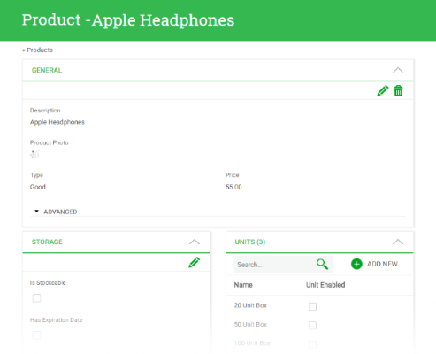
There are many cases in which users need to see the Entity information organized by relevance. The entity information could be the main transaction in display mode (general), a parallel transaction or subordinated transactions. For example in a Product transaction the user may want to see its general information like description, photo, and some basic information like its units or categories and storage information.
 |
| Product Entity Manager |
The information can be grouped in tabs, and sections. This page shows how to use the “Component Group” node in order to organize the entity’s information.
In order to enable this functionality, you must go to “K2BEntityServices” settings -> “Template” node and set the “Components UI Generation” property to “DefinedInComponents”
 |
| "Components UI Generation" property |
If this property is set to “TabbedView”, the only way to display the entity information will be tabs.
By default the property is set to “DefineInComponents”. However, if the knowledge base came from a version lower than 10.4 this property will be set to “TabbedView” to maintain backwards compatibility. In that case developer should change the property in order to enable this functionality.
Once this property is enabled the developer can start using components groups, using their properties and composing them.
In order to manage how the component group should be displayed there are several properties that will be explained in this page.
When you have a “Component Group” there are various ways to show its children. The way the components will be displayed will depend on the “Component Distribuition” property. Its possible values are: “Tabs”, "VerticalTabs", “Cards”, and "Link List".
 |
| "Component Distribuition" property |
When the “Component Distribution” property is set to “Tabs”, each child of the “Component Group” will be shown as a tab.
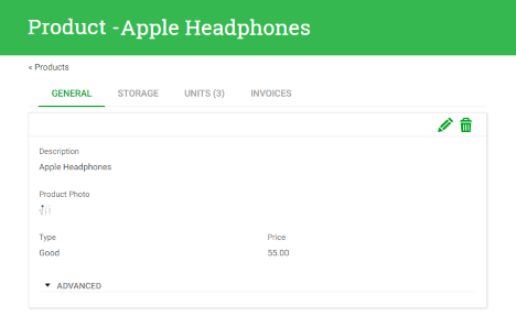 |
| "Component Distribution" set to tabs |
When the “Component Distribution” property is set to “Tabs”, developer can choose if the selected tab will be included as a parameter in the url. That means that if the user clicks a tab the url will change. So if the user performs an action that directs him to another page, when returning the last tab selected will be shown.
If this property is set to false, when returning to the entity manager, the first tab will be shown.
In each Entity Manager, only one "Component Group" can have the “Tabs Included in Url” property set to "True".
When the “Component Distribution” is set to “Cards”, the children visualization varies according to the value of the “Component Grouping” property. The “Component Grouping” property has two possible values:
- Independent Section
- One Section
 |
| "Component Grouping" property |
When using “Independent Sections”, each child will be shown in an independent card.
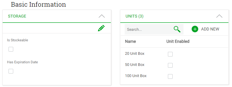 |
| "Component Grouping" set to Independient Sections |
When using “OneSection”, all the children will be shown in one card.
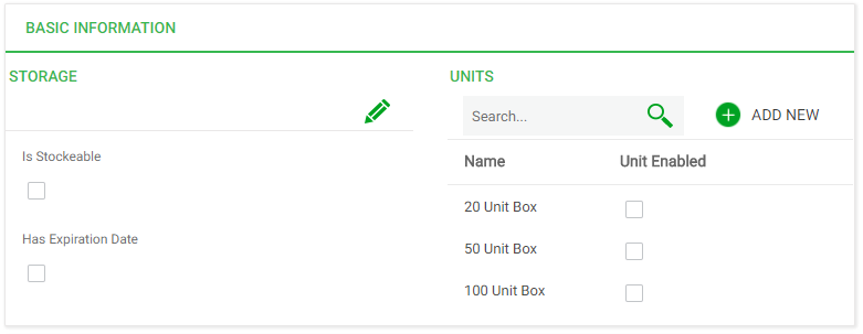 |
| "Component Grouping" set to One Section |
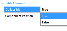
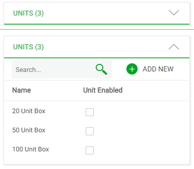
The “Collapsible” property allows components to be collapsed in runtime.
 |
 |
| "Collapsible" property |
"Collapsible" property set to true |
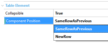
The “Component Position” property allows the developer to place several components in the same row. Its possible values are:
- “NewRow”
- “SameRowAsPrevious”
This property is available in “Component Group”, “Parallel”, “General”, “History Component”, “UserDefined” and “SubWorkWith” nodes whose parent has the “Component Distribution” property set to “Cards”.
When this property is set to “NewRow” the component will be displayed in a new row. When set to “SameRowAsPrevious” will be shown in the same row as the previous component.
 |
 |
| "Component Position" property |
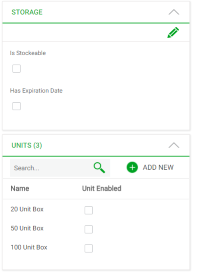
"ComponentPosition" property set to "SameRowAsPrevious" |
The developer can configure the responsive behaviour by changing the “Responsive Sizes” property that is available in “Component Group” nodes with “Component Distribution” set to “Cards”.
 |
 |
| Entity Manager in a large |
Entity Manager in extra small |
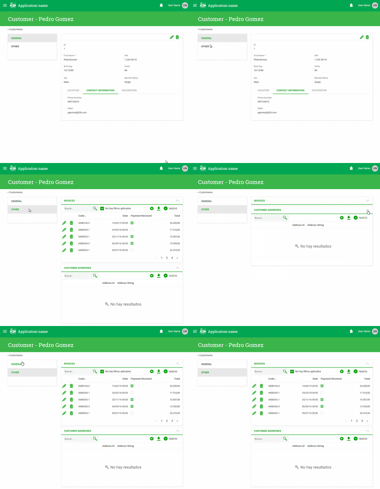
The “Vertical Tabs” creates this UI.
 |
| Vertical tabs |
All components are included in a menu. This is another way to arrange components in the entity manager.
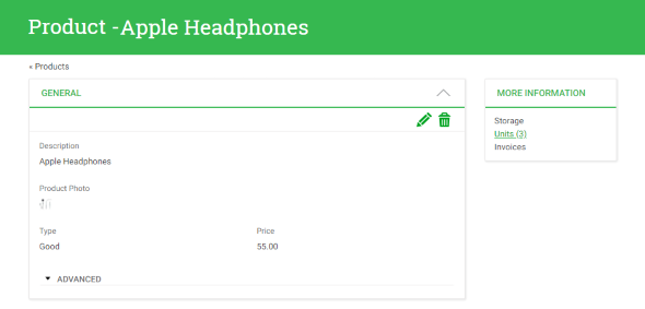
The LinkList option can be used to save space in the Entity Manager, by showing a card with a list of links that allow the end user to open components in a popup screen.
 |
| Link list runtime appearance |
That way those components are initially not visible, and can be accesed when necessary.
This option should be used for components that are not frequently used. An Entity Manager may contain several Component Groups with "Components Distribution" set to "Link List". This can be used to group components in link list sections according to the component's meaning to the user.
The “Code” property is used by K2BTools as a identifier for the component. This property is available in “Component Group”, “General”, “Parallel” , “User defined” and “History Component” nodes. Codes must be unique inside an Entity Manager.
The way the title of the component will be shown depends on the parent node. If the “Component parent has the “Component Distribution” property set to “Tabs” the title will be shown in the Tab.
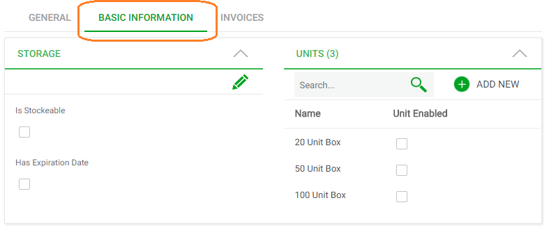 |
| "Title" set to at "Component Group" inside a "Component Group" with "ComponentDistribuition" set to "Tab". |
If the parent has the “Component Distribution” property set to “Cards” its visualization will depend on the “Component Grouping” property.
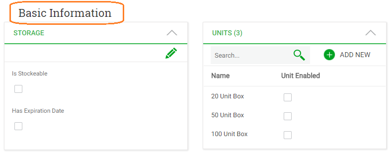 |
| Title "Component Grouping" set to "Independent Sections" |
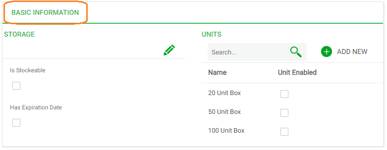 |
| Title "Component Grouping" set to "One Section" |
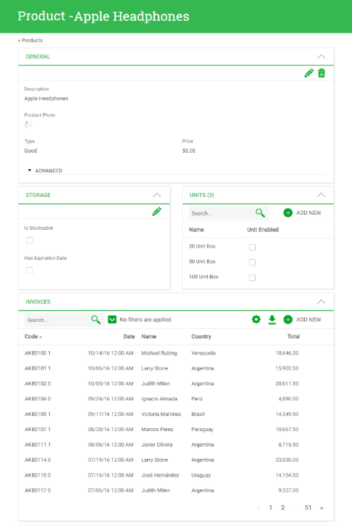
Suppose we have a Product transaction. The Product has Units, Categories, Storage information and WareHouses if the product is stockable. The user wants to see product information like this.
 |
| Product Entity Manager |
In order to achieve that, the main “Component Group” must have the “Component Distribution” property set to “Cards”, and the “Component Grouping” property set to “Independient Sections”. This component group contains four children, corresponding to the four components shown.
In order to show the Units component next to the Storage component, its "Component Position" property must be set to "SameRowAsPrevious", as shown below.
 |
| Instance used to generate example |
|