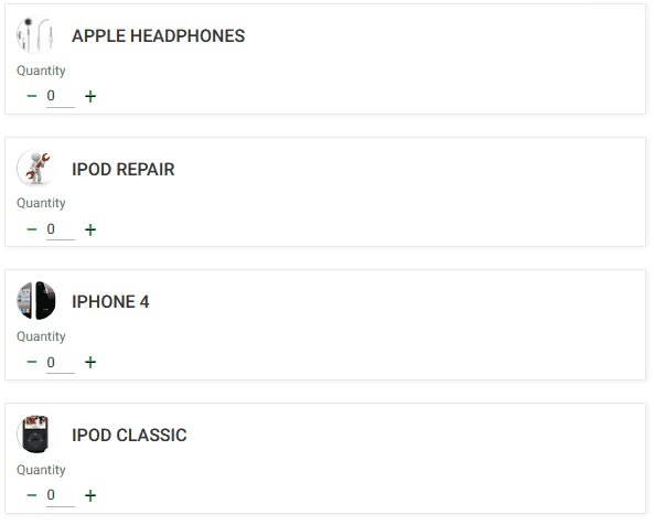
The Stepper control type, shown as "Stepper K2BTools" in GeneXus, applies to numeric fields. Visually, it is very similar to the standard “Edit” control type, adding a button on each side: A “minus” button on the left and a “plus” button on the right.
The control accepts manual input (type in a value) or increase/decrease the current value using the above buttons.
Control value bounds are always checked. If the user types in a value larger than the maximum, the maximum allowed is set when the focus leaves the control. The same for the minimum allowed value.
 |
| Stepper UI |
The developer can define the valid interval (example: input must be between 1 and 10), and the step: the amount that will be added to or subtracted from the value when increasing/decreasing.
In previous versions this could be achieved by adding a variable and two actions. This solution is better because:
- The behavior is encapsulated in a UC 2.0 and is reusable in the entire app.
- The UI is better.
- The increase/decrease behavior is implemented in javascript functions in the browser, no need for server round trips.
The stepper can be configured using the Min Value, Max Value, and Step properties in ControlInfo nodes. The min and max properties define the range of valid values for the control, and the step property defines the value that should be added/subtracted from the control's current value when the minus and plus buttons are pressed.
For example, imagine that a stepper is created with these values:
- Min value = 0
- Max value = 10
- Step = 2
This table examplifies how the control should behave
| Current Value |
Value after clicking + |
Value after clicking - |
| 1 |
3 |
0 |
| 2 |
4 |
0 |
| 3 |
5 |
1 |
| 9 |
10 |
7 |
Min value, Max value, and Step must be integers.
Stepper is available as of K2BTools 13.1
|