The K2BTools Dynamic Combo Box extends the UI and functionality of the standard GeneXus dynamic combo boxes, while keeping the definition as simple as the latter.
 |
| K2BTools Dynamic Combo Box |
Moving from standard GeneXus dynamic combo boxes is as simple as changing the control type to “Dynamic Combobox K2BTools”. No other property changes are required. With this change only, the application user will experience a slight change in UI.
To fully use the power of the extended comboboxes the developer can use the following options.
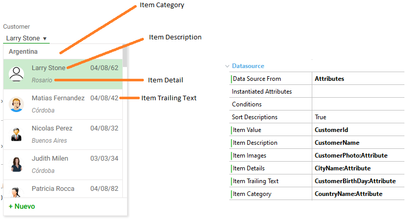
In addition to the “Item Value” and “Item Description” properties, the developer can optionally set any combination of the following properties. The combo item design is adjusted according to the available information.
- Item Image
- Item Detail
- Item Trailing Text
- Item Category
See how each property is used in the image below:
 |
| Properties mapping |
See how the combo is shown for each combination of these properties below.
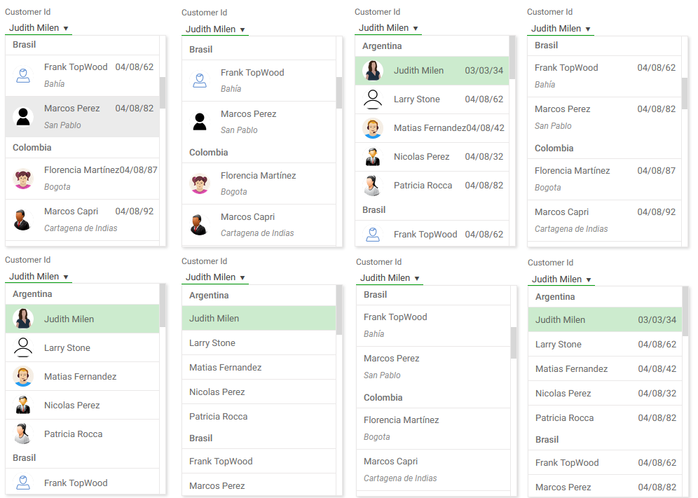 |
| Variants with categories |
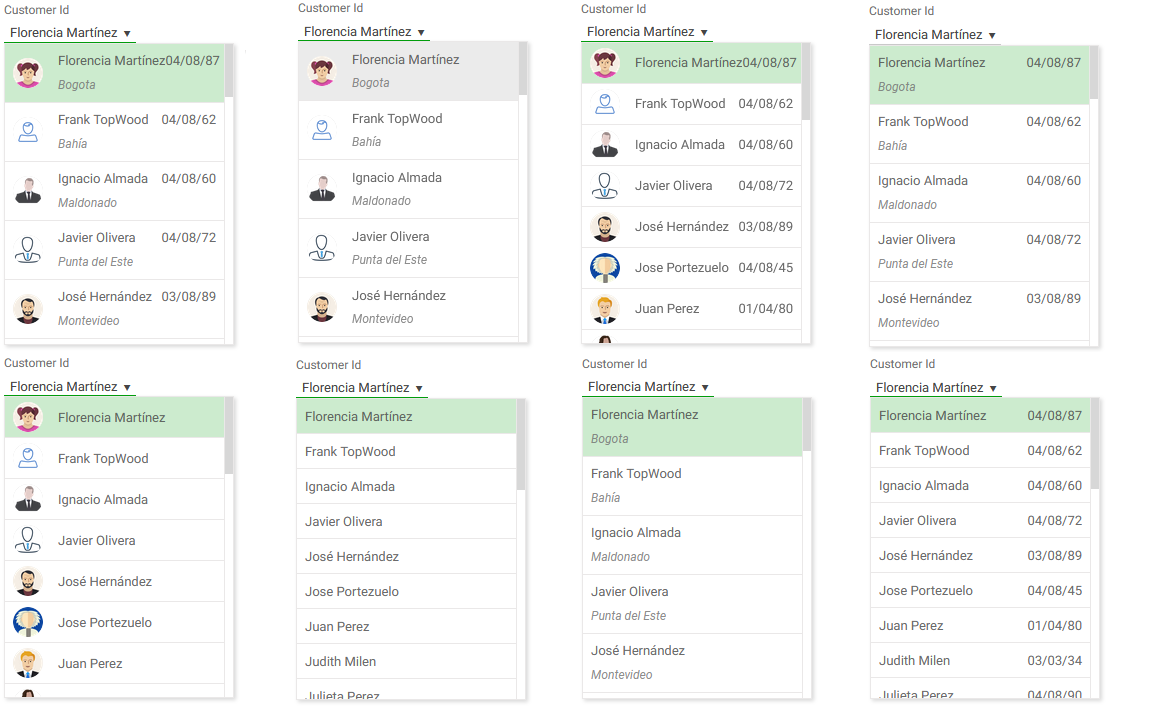 |
| Variants without categories |
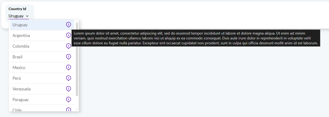
Each item can include additional information in a tooltip, this option is only available when loading the control using a data provider. When included, an image will be included on the right of each item, the tooltip is associated with the image as shown below.
 |
| Tooltip |
The tooltip can be set using the "tooltip" field in the "K2BT_ExtendedControlValues" SDT.
When the combobox contains a large number of options available the developer may turn on search, by setting the Include search property. If so, a search field is included in the control and only items matching the search are shown in the list.
Search is performed on all text values of each entry (value, description, etc).
 |
| Search inside the combobox |
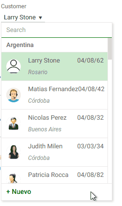
If, at run-time, a required item does not exist, the application user may create it without leaving the context. For example, if an application user is entering a sales order and the customer does not yet exist, the user may like to create it and continue entering the order without losing the information already entered.
The “Enable add item” property controls whether or not this functionality is available to the application user. When turned on, a Web Component must be specified in the “New Item Component” property. The component may be a transaction. If the transaction has the Entity Services pattern applied, integration is automatic.
If the component is not a transaction, the developer must specify its parameters in the “New Item Parameters” property, and the component must follow some rules.
If Data source=Attributes the variable is automatically created and loaded by K2B Tools.
If Data source=Dataprovider and the data provider's return type is K2BT_ExtendedControlValues, then no further conversion is done. If the Dataprovider returns any other structure, the extended properties are used to map the returned data type members to the K2BT_ExtendedControlValues ones.
- Data source from values
- Transactions allow the Dataprovider value only.
- The reason for this is that a for each/endfor is required to implement the Attributes value and for eachs are not allowed in transactions.
- Dataprovider parameters, that depend on input variables, have a different behaviour from GeneXus Dynamic Combo. As the K2BTools control types are loaded in events, the variable or attribute is not automatically instanciated. Some suggestions
- Do not use attributes as a parameter in transaction, as transaction events have no base table.
- .ControlValueChanged of the related input can be used and the subroutine Att_<attname>_SetValues can be called. By doing this the combo gets loaded again.
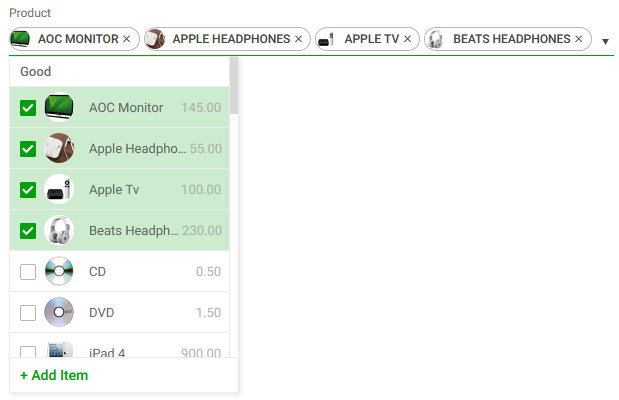
This control can be used in collection variables. When used in that context, the developer can configure how the selection is shown in the combobox's header: The selection may be shown as text (the concatenation of the selected item's descriptions) or as separate tags (one tag for each selected item).
This behaviour is configured using the "Show selection as tags" and "Header max visible items" properties.
 |
 |
| Selection shown as tags |
Selection shown as text |
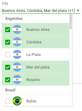
If the selection is shown as text, the control does not show all selected items. Instead, the developer can choose how many items should be included in the header, and if more items are selected in runtime the control will display the amount of selected elements that are not shown.
For example, if the items "1", "2", "3", "4", and "5" are selected, the "Show selection as tags" is set to false, and "Header max visible items" is set to 3, the "1, 2, 3, (+1)" value will be shown in the combobox's header.
When used in a collection variable, this control also supports adding "Clear selection" and "Select all" actions, that alter the variable's value accordingly. To enable these actions use the "Enable Clear Selection Action" and "Enable Select All Action" properties.
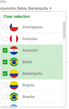 |
| Clear selection action |
|