When selecting items in large grids the user may lose track of which elements are selected. This can happen when the grid has many pages, or when the user changes the filters used while selecting items.
Sometimes actions act on all the items that were selected, regardless of which are visible at the moment of execution. In this case, losing track of the selected items is troublesome as the user may be performing the action on items that weren’t supposed to be selected.
The Selection Summary feature can be used to mitigate this issue. When using it, the user can see all the selected items alongside the grid. These items are shown always, and paging/filtering do not apply to this list.
The developer can choose how the items are shown. Currently, three options are available: On grid’s right side, below it, or as a “Tab”. The choice between these options is up to the developer, see which option fits its needs the best.
 |
| Selection summary below |
 |
| Selection summary tab |
 |
| Selection summary on the right |
 |
| Selection summary count |
If none of these options fit the developer needs, a new one custom made for its scenario can be created.
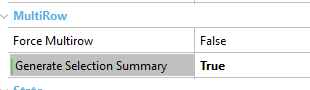
This feature can only be enabled in grids where row selection is available. This can happen because the grid contains an action with Row Selection = Multiple or because the grid has its Force Multirow property set to True.
 |
| Generate selection summary property |
In this scenario, the “Generate Selection Summary” property is available. Set it to True to enable the selection summary feature. After enabling it, the selection summary will be shown as a Tab using the same appearance as the grid.
To change the UI, use the “Configure selection summary action”.
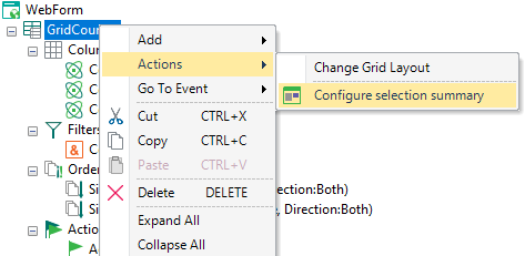 |
| Configure selection summary action |
When executing this action, the following dialog will appear, use it to select how the summary should be shown.
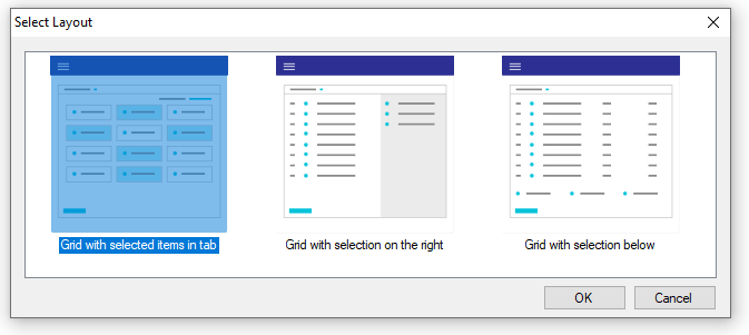 |
| Configure selection summary layout selection |
After executing this action two things will happen:
- The "Responsive Layout Object" property for the grid will be updated to match the selected layout.
- A "Selection Summary" node may be added to specify how each item in the selected list should be shown. This node will be added only if the selected option has its "Selection Summary Layout" property set to a non-empty value.
The selection summary node can be used to customize how the selected items are shown. If not present, they are shown in the same way as in the main grid.
When present, this node can determine if the selected items will be shown as a standard grid or as a grid based on a Dynamic Layout. In the latter case, it also determines which layout should be used.
This node's children specify the grid's contents. All the variables added here must reference a field in the main grid. If the selected items grid is based on a dynamic layout, each field should specify which slot in the layout it references.
|