The image region selector control type was designed to solve many scenarios with a common structure: the application user has to select an area of an image.
Common area examples are a theater, an airplane, an event's venue or even a map. Regions examples are seats, neighbourhoods, geographic states.
The fastest way is to view how this control works is to create a Web Panel Designer instance having a Variable node with a Control info node where the Control type is ImageRegionSelectorK2BTools.
Running this Web Panel shows the demo content.
The developer can use this control outside the Web Panel Designer but it requires more effort.
The control receives and returns a value (for example, the seat number). The variable having this control as the control type is the one that holds the value.
The control needs additional information that it grabs from a structure (SDT). The structure name is K2BT_ImageRegionsDefinition and is filled by a Data Provider. The example Data Provider name is K2BT_ImageRegionSelectorTheaterSample. You can check its code for details.
The structure contains:
This is the map where all Regions (see above) are layed out.
Each region defines an area in the above Frame. Each region has a status (available, unavailable) and an image associated to the status.
The selected area is the one whose Id field is equal to the Variable value.
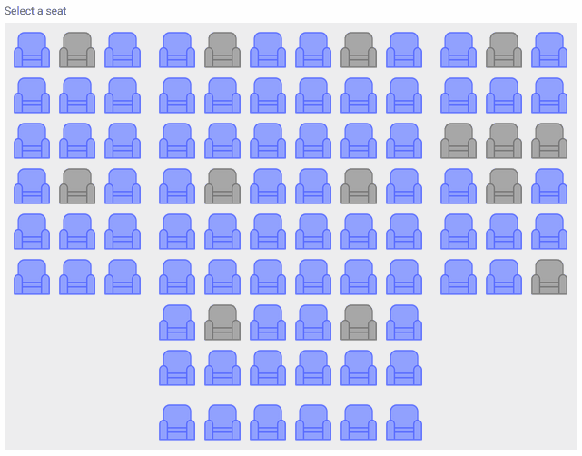 |
| Sample in runtime: each seat is defined as a region |
Using that SDT the developer can define each of the regions that define the image and how that image will be shown in runtime: its size, its class, etc.
The SDT's structure is defined as follows:
- Regions (collection)
- id: Region identifier. Must be unique
- top: Region's position relative to the top of the image
- left: Region's position relative to the left of the image
- height: Region's height
- width: Region's width
- availableImageURL: URL for the image that should be shown when the region is available for selection.
- unavailableImageURL: URL for the image that should be shown when the region is not available for selection.
- selectedImageURL: URL for the image that should be shown when the region is selected.
- status: Indicates if the region is available or not.
- name: Optional. Region's name, it is shown alongisde the region's image.
- tooltipLines: Optional. Can be used to define a the tooltip that will be shown when the user hovers the region. This property contains a collection of character values, each item will be shown in a new line.
- class: Optional. If set, this property's value will be set as a class for the region, enabling UI customization using the Theme/Design System object used in the panel.
- selectableRegionCoordinates: Optional. If set, it defines the polygon inside the region's box that should be clickable. This can help in cases where region boxes overlap (and images with transparent areas are used) to define the precise region that should be considered.
- Frame
- width: Container's width
- height: Container's height
- class: Optional. Can be used to set the container's class
- backgroundImageURL: Optional. Can be used to set a background image to the container.
This control can be used in collection variables. When used in that context, the control's UI does not change: the only change in runtime is that the user can select more than one item.
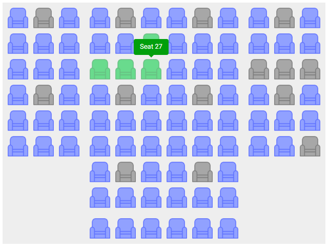 |
| Image region selection in a collection variable |
The developer can limit how many items the user may select using the "Max Selection Size" property. If the property is set to 0, the selection size is not limited.
|