This control type can be used to include a slider in a form. The end user can use this slider to enter a number using the slider instead of typing it.
The developer can customize how the slider is generated using its properties, defined as shown below. Some properties are shared with the stepper control type.
- Max: The stepper's maximum value
- Min: The stepper's minimum value
- Step: The stepper's resolution - the minimum value increased/decreased while using the slider.
- Number Visible: Determines if the numeric value should be shown alongside the slider control.
- Numebr Readonly: Determines if the value shown alongside the slider should be editable.
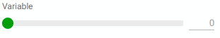 |
| Example 1: Min = 0, Max = 10, Step = 1 |
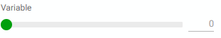 |
| Example 2: Min = 0, Max = 10, Step = 0.1 |
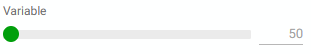 |
| Example 3: Min = 50, Max = 100, Step = 1 |
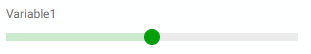 |
| Example 1: Number invisible |
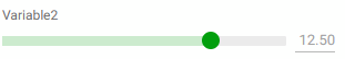 |
| Example 2: Number visible, readonly |
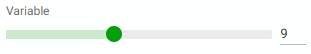 |
| Example 3: Number visible, editable |
|