In many cases the end user must select an option from a list when completing a form. When the list is small a “Toggle” control may be used, where the list is shown directly in the form and the user may select an option simply by clicking on it.
The control type called “Toggle K2BTools” can be used to implement these scenarios.
This control can be used in scenarios similar to comboboxes, but using a different UI. We’ve included three UI variants of this control that can be selected by the developer.
The developer can configure the item values, item descriptions and images as in a dynamic combo. If the attribute/variable is based on an enumerated domain, the options are loaded from the domain automatically.
Options for the Style property are shown below:
 |
 |
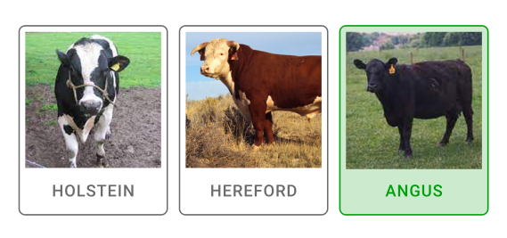 |
| Toggle Style = SmallChip |
Toggle Style = MediumChip |
Toggle Style = LargeRectangle |
The developer can define the items in the list in three ways, shown in the Data source from property:
- Attributes: Items are loaded from the database in the same way used in Dynamic Combo Box control type. In this case, the developer can use the Item Values, Item Descriptions, and Item Images to determine which attributes to use when loading the items.
- DataProvider: Items are loaded from a Data Provider object. If the data provider's return type is K2BT_ExtendedControlValues, then no further conversion is done. If the Dataprovider returns any other structure, item values, item descriptions, and item images properties can be used to map the returned data type members to the K2BT_ExtendedControlValues ones.
- Domain: Items are loaded from the domain the attribute/variable is based on (must be an enumerated domain).
The "Attributes" option is not available in transactions. The reason for this is that a for each/endfor is required to implement the Attributes value and for eachs are not allowed in transactions.
This control can be used in collection variables. When used in that context, the control's UI does not change: the only change in runtime is that the user can select more than one item.
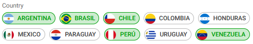 |
| Toggle control in a collection variable |
|