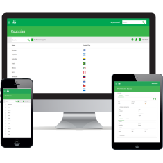
To understand the basics of Responsive Web Design, this exercise shows how it works from an end user perspective. Please follow these steps:
- Run your application and enter the “Customer” Work With.
- Resize the browser’s window.
See that, as you resize the window, the content adapts to its size, in this case, showing more or less columns and changing labels position.
 |
| Responsive Web Design |
The image above puts this effect in context. The smaller sizes usually correspond to smart phones and larger ones to desktops. Your design must take into account these differences and show the most relevant information in each one.
The size of the screen defines what fields are visible and how they are layed out. To easy the development, screen sizes are grouped into named screen size ranges: “Extra Small”, “Small”, “Medium” and “Large”. That is, layout can be set for each named screen size range.
In the following exercises you will learn how to configure which elements are visible in each screen size.
Tip: If you have a smartphone or tablet, you can upload your app to the GeneXus cloud and access it from your device, to see how the app behaves in it.
|