 Description Description
Columns control can be used in panels created using K2BTools to divide the screen vertically (by adding Column nodes), and populate these columns with different types of content. The content used in each column can be completely independent among them.
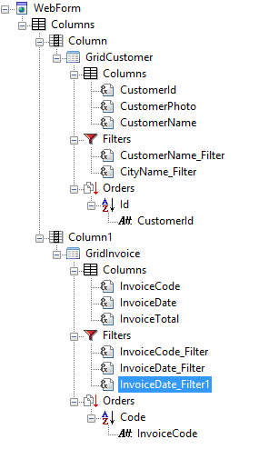
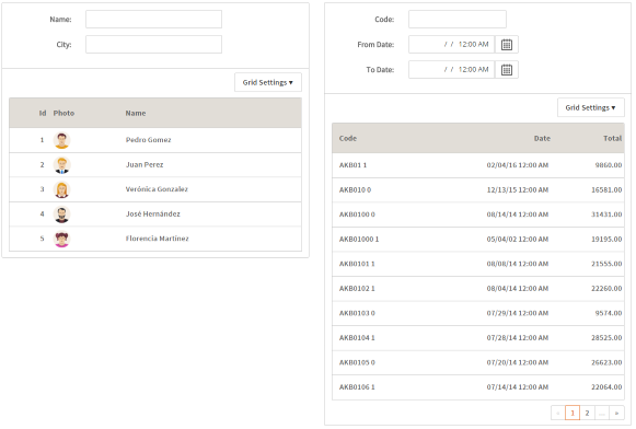
In the following example, a columns node was included in a web panel, containing two column nodes as children. Each of these includes a Group control, with different contents. On the left side of the screen, the result is displayed. In the opposite side, the tree used to define the web panel is shown.
 |
 |
| Tree defining the web panel |
Runtime appearance |
| Category |
Name |
Value |
| General |
ControlName (Id) |
The node's Id. Must be unique inside the panel. |
| ContentDistribution |
This property defines the method of distributing columns within the layout.
- ColumnPercentages: Each column is assigned a size based on the 'Responsive Sizes' property. This configuration facilitates the creation of a responsive table where each column width adjusts according to the specified percentages, ensuring optimal display on different devices.
- Flow: Columns are distributed based on their intrinsic size. This method utilizes a flex table layout where the width of each column adapts to its content. The behavior of this distribution can be further customized by using the 'Class' property, allowing for specific styling and responsiveness adjustments.
|
| Responsive Sizes |
Only when ContentDistribution=ColumnPercentages. Determines the layout of the items contained in this control according to the screen size of the device used in runtime. For more information, see Introduction to Responsive Web Design and Responsive Sizes Properties. |
| Appearance |
Class |
The theme class that should be used when rendering the control in the panel's form. |
|