 Description Description
The actions group serves as a container for actions that should appear toghether in the screen. For example, one of these nodes can contain a group of actions that should appear below a particular grid. Being a simple container it has almost no properties, instead, this node's behaviour is determined by the properties if its children.
This node's runtime appearance depends greatly on the appearance of the Action nodes it contains. As the example below demonstrates, it is possible to combine different types of actions within a single actions node.
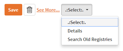 |
| An actions node in a web panel containing actions of different types |
To know how actions' appearance can be modified, see the action's documentation.
| Category |
Name |
Value |
| General |
Render |
Indicates the render that should be used when including this control in the Interface.
In Web Panels, possible values are gxui or Default. Note: This property is only available when not using Responsive Web Design.
In SD Panels, possible values are InLayout and Toolbar. If Toolbar is chosen, the actions node will not be generated in the form's layout, and its contents will be included in the application's toolbar.
|
| Layout Slot Name |
Contains the name of the Actions (Dynamic Layout Definition) node in the dynamic layout object referenced by this node.
This property is available only when this node's parent is a LayoutContent node.
|
|