 Description Description
The "Tabs" node is a way of introducing Tabs to a web panel created using K2BWebPanelDesigner. These tabs are created in a way that doesn't require a page load to switch between them. Tabs can both be at the root of the tree defining the web panel, or at any other level (for example, tabs can be used inside a column node).
All data contained inside tabs is loaded when a refresh occurs. Because of this, if one or more of the tabs included in this node contain elements that require a long time to load, page load time will be longer (even if the tab performing the time-demanding operations is not initially visible).
To know more about how to create individual tabs, please refer to Tab
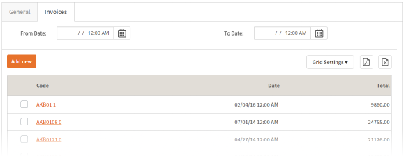
The following screenshots show a set of tabs.
 |
| Tabs runtime appearance |
| Category |
Name |
Value |
| General |
ControlName (Id) |
The node's Id. Must be unique inside the web panel. |
| Render |
Determines the render used in the Tabs control. Can be "gxui" (To create a control based on the gxui.Tabs control) and "Default", to provide the default K2BTools implementation.
Note: Not available when using Responsive Web Design.
|
|
| Invisible Mode |
Contains the value for the Invisible Mode property in the control. |
|