|
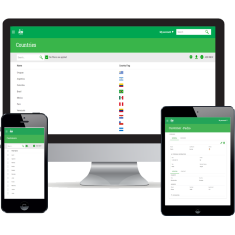
Responsive Web Design (RWD) is the name given to the set of technologies that allow developing web applications whose interface is adapted to the device used. In particular, it is essential that the interface can be adapted to the various screen sizes available.
 |
| Responsive Web Design |
GeneXus has incorporated the possibility to generate applications with these features in version Evolution 3. To do so, several changes were made, including a new abstract editor to define the screens' Web Form and the possibility to generate conditional themes: themes with rules that determine how each class should look depending (among other things) on the size of the screen.
To learn more about these concepts, reading the GeneXus documentation on this topic is recommended. In the following sections contain an overview of the changes made to K2BTools to support this new type of Web Forms.
Users may access a web application using a variety of devices. These devices are classified according to their screen size into four categories: Extra Small, Small, Medium, and Large. The runtime layout of the screen's components is determined by the category of the user's device screen.
The categories are defined as follows:
| Category |
Screen Size |
Typical Use
|
| Extra Small |
Width < 768px |
SmartPhones
|
| Small |
768px <= Width < 992px |
Tablets |
| Medium |
992px <= Width < 1200px |
Desktop |
| Large |
1200px <= Width |
Desktop |
In the specification of patterns and the Web Panel Designer, several properties have been added that allow the developer to define how the generated interfaces have to be adapted to the size of the device used by the end user. In some cases, when setting the behavior of an interface for smaller devices, the layout of the components on screen has to be changed. To do so, GeneXus has incorporated the concept of “Responsive Table”. They are special tables whose Layout can be changed according to the device size. To define these Layouts, the tables contain properties called “Responsive Sizes”. To learn more about how Responsive Tables work, click here. In K2BTools we've created properties similar to the previous ones in all the nodes containing plain attribute sections. The corresponding nodes are as follows: Attributes, Column, Columns, Filters, Group, Line Separator, and Tab. These properties allow changing the final layout of the elements contained in the corresponding node for each one of the sizes available. The elements' default value is automatically calculated by K2BTools so that: - In “Large”, “Medium”, and “Small” sizes, the layout will be equivalent to that generated with previous versions of K2BTools (considering the “NoSkip” properties).
- In the “Extra Small” size layout, all the elements will be organized in a single column (1 element per row).
There is an instance of TrnForm with the following structure:
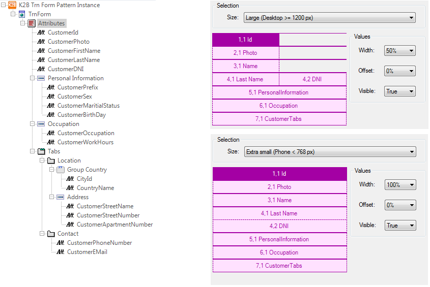 |
| K2BTrnForm Instance |
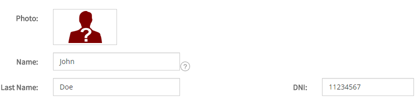
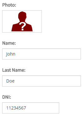
The layout generated (for the first section) will be as follows:
 |
 |
| Desktop view |
Cell phone view |
Note: This isn't the only way to change the position of the components generated by K2BTools. To determine the position of generic components (filters area, grid, paging, etc.), the layout object can be used as described in the section called Responsive Layout Objects. These properties allow the developer to determine if certain components are visible or not in each screen size. Actions, Attributes and Variables contain these properties.
This property allows the developer to specify the proportion of the space allocated to a certain field that should be used to display the field's caption. |