|
In some cases, when setting the behavior of an interface for smaller devices, the layout of the components on screen has to be changed.
To do so, GeneXus has incorporated the concept of “Responsive Table”. They are special tables whose Layout can be changed according to the device size. To define these Layouts, the tables contain properties called “Responsive Sizes”. To learn more about how Responsive Tables work, click here.
In K2BTools we've created properties similar to the previous ones in all the nodes containing plain attribute sections. The corresponding nodes are as follows: Attributes, Column, Columns, Filters, Group, Line Separator, and Tab.
These properties allow changing the final layout of the elements contained in the corresponding node for each one of the sizes available. The elements' default value is automatically calculated by K2BTools so that:
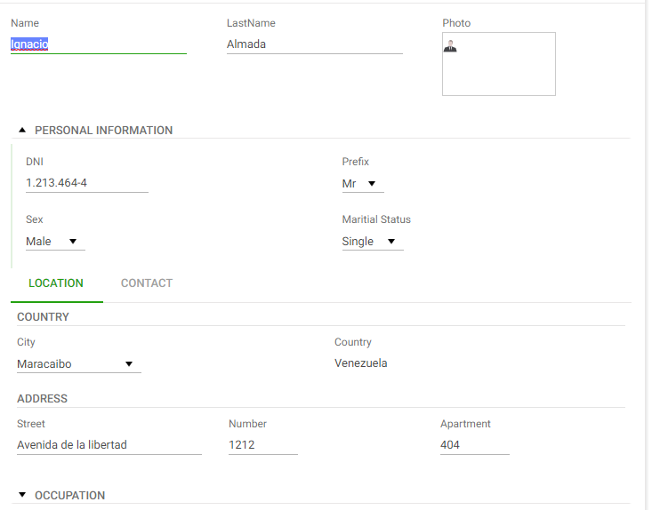
1. In “Large”, “Medium”, and “Small” sizes, the layout will be equivalent to that generated with previous versions of K2BTools (considering the “NoSkip” properties).
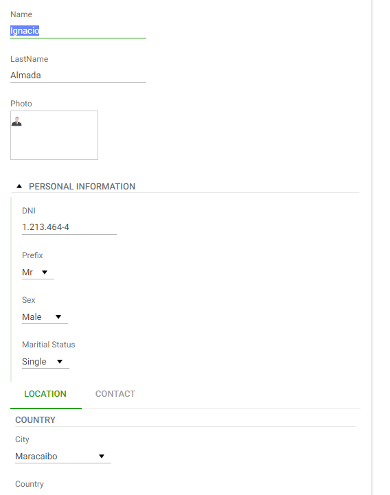
2. In the “Extra Small” size layout, all the elements will be organized in a single column (1 element per row).
There is an instance of TrnForm with the following structure
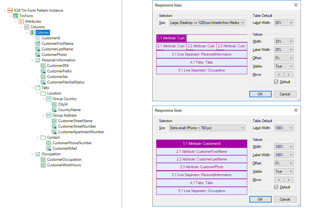 |
| Responsive sizes example structure |
The layout generated (for the first section) will be as follows:
 |
 |
| Responsive sizes extra small runtime |
Responsive sizes large runtime |
This isn't the only way to change the position of the components generated by K2BTools. To determine the position of generic components (filters area, grid, paging, etc.), the layout object can be used as described in K2BWebPanelDesigner Abstract Layout Editor Layout Object
|