Calendar view nodes can be used to include a calendar component in the UI and use it to show and edit data. A calendar view shows the information for one or more calendars, that in turn contain zero or more items that are defined by an id, a description, and a pair of start/end dates.
The calendar's UI contains the following components:
- The calendar itself: the component can show a day, week, or month and the items contained in them.
- A header: the header does not display data. Instead, it provides several options that allow the user to navigate the calendar and determine what data should be shown in the main component. These subcomponents (listed in the same order that tehy appear in the UI) are:
- Calendar navigation: The user can choose to navigate to the current date of to a manually specified date using the component on the top left.
- Previous / Next period navigation: The user can go to the previous/next period using the arrows shown in the header.
- Month name: The name of the month being shown, to provide context.
- Calendar selection: When multiple calendars are provided, this control can be used to select which are shown.
- View selection: can be used to select which view (day/week/month) should be used in the main view.
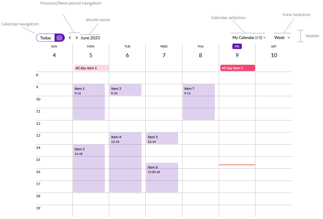 |
| Calendar view components |
The data shown in the component is determined by the calendar nodes contained in this node.
| Category |
Name |
Value |
| General |
Control Name |
The components's control name. Must be unique within the web panel. |
| UI Controls |
Show Header |
Determines if the header should be shown. |
| Show Calendar Navigation |
Determines if the calendar navigation component should be shown. |
| Show Period Navigation |
Determines if the previous / next period buttons shown be shown in the UI. |
| Show Calendar Selection |
Determines if the user can choose which calendars should be shown in the UI. |
| Show View Selection |
Determines if the user can change the view (day/week/month) using a combobox in the UI. |
| Start Hour |
The first hour that should be shown in the day and week views. |
| End Hour |
The last hour that should be shown in the day and week views. |
| Items Per Day In Month View |
Determines the maximum amount of items that are shown in each day in the month view. |
| Behaviour |
Readonly |
Determines if this control should allow the user to add new items or not. |
| Calendar Views |
Day View Enabled |
Determines if the day view should be available to the user. |
| Week View Enabled |
Determines if the week view should be available to the user. |
| Month View Enabled |
Determines if the month view should be available to the user. |
|
Work week view enabled
|
Determines if the Work week view is available to the user.
|
|
Default Content View
|
Determines the default view that will be opened when the component is loaded
|
| Week start day |
Determines what is the day the week view must start. Options are Sunday (default) and Monday |
Calendar items may include actions. When present, the component will display a menu inside each item to execute those actions.
When using patterns, actions are included automatically depending on the context.
When creating a custom web panel using Web Panel Designer, the developer can add actions using a dataprovider to load calendar items and their corresponding actions. The developer can implement how those actions should behave using the "U_OnActionClicked" subroutine associated with the view.
Aside from the actions described in the previous section, the calendar handles two events:
- Item clicked: executed when the user clicks on an item.
- New draft: executed when the user selects a time period to create a new item.
- DraftCancelled: executed when a draft was being created but is cancelled by a user action.
As with the actions, the implementation for these events is inferred automatically when the calendar view is included in a WorkWith or SubWorkWith interface.
When creating a custom web panel using Web Panel Designer, the developer can implement what should happen when these events occur using the "U_OnItemClicked", "U_OnNewDraft", "U_DraftCancelled", and "U_OnActionClicked" events. In this case, the control will set the value for several variables before invoking the method.
All events:
- &SelectedCalendar_{CalendarViewName}: The calendar that was selected by the user.
- &DateFrom_{CalendarViewName}: The first date shown currently in the calendar.
- &DateTo_{CalendarViewName}: The last date shown currently in the calendar.
Item clicked:
- &SelectedItem_{CalendarViewName}: The item that was clicked by the user.
Action clicked:
- &SelectedItem_{CalendarViewName}: The item where the clicked action is located.
- &ExecutedAction_{CalendarViewName}: The action that was clicked.
New draft:
- &DraftItem_{CalendarViewName}: The draft that is being created by the user (including the range that was selected).
The calendar view control expose the following methods:
-
GoToDate(year, month, day): This method allows the developer to set the date shown in the calendar. The calendar view (day, week, work week, or month) will not be changed when invoking this method. Instead, the control will show the appropriate period containing the date passed by parameter.
It can be used to move the calendar view to a given date without using the next/previous actions.
-
GoToNextPeriod: This method makes the control go to the next period in the selected view. The effect of calling this method is the same as using the next period button in the UI.
-
GoToPreviousPeriod: This method makes the control go to the previous period in the selected view. The effect of calling this method is the same as using the previous period button in the UI.
-
SwitchView(view): This method can be used to select the view shown (Day, Week, Work week, Month). This is equivalent to changing the view using the combo box available in the UI. The view parameter's type should be based on the "K2BTools.Controls.Calendar.ContentViewOption" domain. For example: Calendar.SwitchView(ContentViewOption.Day).
If can be used to restore the view as it was, for example, the last time the user used the application.
|