 Description Description
This type of node is used in panels created with K2BTools. They represent single columns within a Columns node.
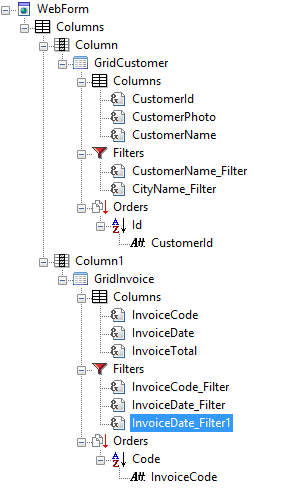
In the following example, two column nodes were included inside a columns node. Each column includes a Group control, with different contents.
 |
 |
| Tree defining the panel |
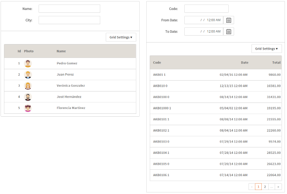
Runtime appearance |
| Category |
Name |
Value |
| General |
Id |
Contains an unique identifier for the column inside the panel. |
| Align |
Contains the value passed to the Align property in the cell that belong to this column. Possible values are:Left, Center, and Right.
Notes:
|
| Vertical Align |
Contains the value passed to the Vertical Align property in the cell that belong to this column. Possible values are: BaseLine, Bottom, Middle, and Top.
Notes:
|
| Responsive Sizes |
Determines the layout of the items contained in this control according to the screen size of the device used in runtime. For more information, see Introduction to Responsive Web Design and Responsive Sizes Properties. |
| Size |
Width |
Contains the width of the column in runtime.
Notes:
|
| Height |
Contains the height of the column in runtime
Note:
|
Note: The table below contains the complete set of possible children. Some nodes may not be available in all scenarios.
|