|
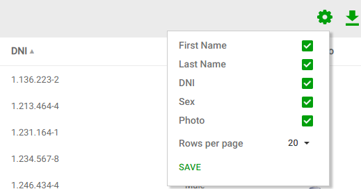
This component is always associated with a grid, and determines its behavior. In particular, it allows controlling (depending on the grid's configuration):
- Which columns are visible in the grid
- The order in which results are displayed
- The number of rows included in the grid.
- If grid column titles are frozen while scrolling.
- Saving/retrieving saved grid views.
The objective of this component is to hide controls not frequently used (such as the "Order By" selector), to free space in the interface that can otherwise be used more efficiently.
 |
| Grid settings appearance |
The UI for this control is defined by the Grid settings layout object associated with the Basic Layout object used when generating the grid.
When defining a grid, the developer may disable this menu's generation using the "Generate Grid Settings" in WorkWith, SubMenu, and Grid node nodes.
When enabled, the generation of the control for a specific grid depends on the configuration of that grid. That is to say, it is generated if at least one of the following conditions is met:
- The grid allows selecting columns at runtime (according to the "Allow Column Selection" property).
- The grid has more than one associated order (according to the "Order" node).
- The grid allows selecting the number of rows at runtime (according to the "Page Options" property).
- The grid's column titles can be frozen in runtime. For more information read Freeze column titles property
- The end user may define grid views for this grid. For more information read Grid views
|