 Description Description
This node represent a single tab within a Tabs control. As the section "Child nodes" below shows, all kinds of nodes can be included as children of the tab node, providing complete flexibility when it comes to the design of the contents of a particular tab.
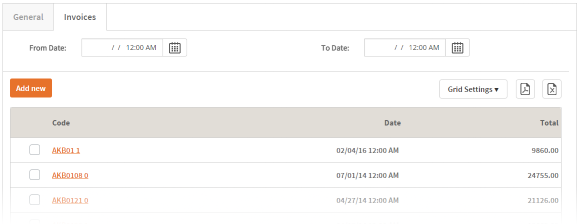
The following image shows an example of tab usage.
 |
| Tabs example |
| Category |
Name |
Value |
| General |
Title |
The string to be shown as the tab's description in runtime. |
| Image |
Contains a reference to an Image shown alongside the tab's title. Note: Only available in SD Panels. |
| Unselected Image |
Contains a reference to an Image shown alongside the tab's title when it is not selected. Note: Only available in SD Panels. |
| Responsive Sizes |
Determines the layout of the items contained in this control according to the screen size of the device used in runtime. For more information, see Introduction to Responsive Web Design and Responsive Sizes Properties. |
Note: The table below contains the complete set of possible children. Some nodes may not be available in all scenarios.
When not contained by a Filters or Attributes node node, a tab can contain:
When placed inside a Filters node or an Attributes node node, a tab can contain:
|